On The Rocks – D&AD New Blood
Branding and Brand Activation creation
Project Intentions
As a self-directed exercise, I wanted to participate in the 2025 D&AD New Blood Competition. Unfortunately, I was unable to commit enough time to this project to complete it to the standard I wanted in time for the competition deadline.
However, I'm proud of the idea and vision I have for this work, as well as the extensive research I carried out to come up with it, so I have since decided to turn it into a passion-project of sorts. My aim is to create enough assets and deliverables to ensure it's a fully fleshed out piece of work that could easily be brought into the real world. To achieve this, I'm also using this as an opportunity to expand my technical skillset.
Brief
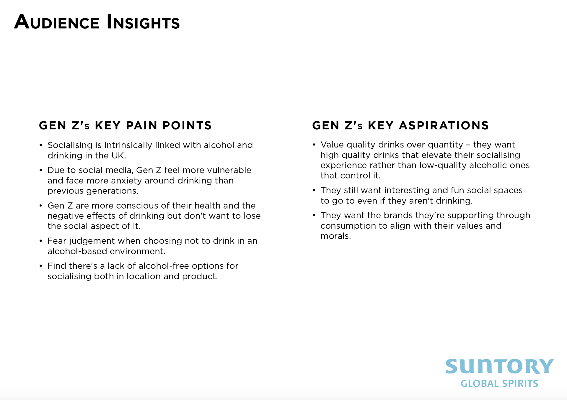
Reimagine one of the given Suntory Global Spirits brands to be a credible non-alcoholic offering for Gen Z: 'the Moderation Generation'.
You must create an identity that honours the original brand but reimagines it for the new category, is driven by real expectations of the Moderation Generation, and works cohesively across touchpoints.
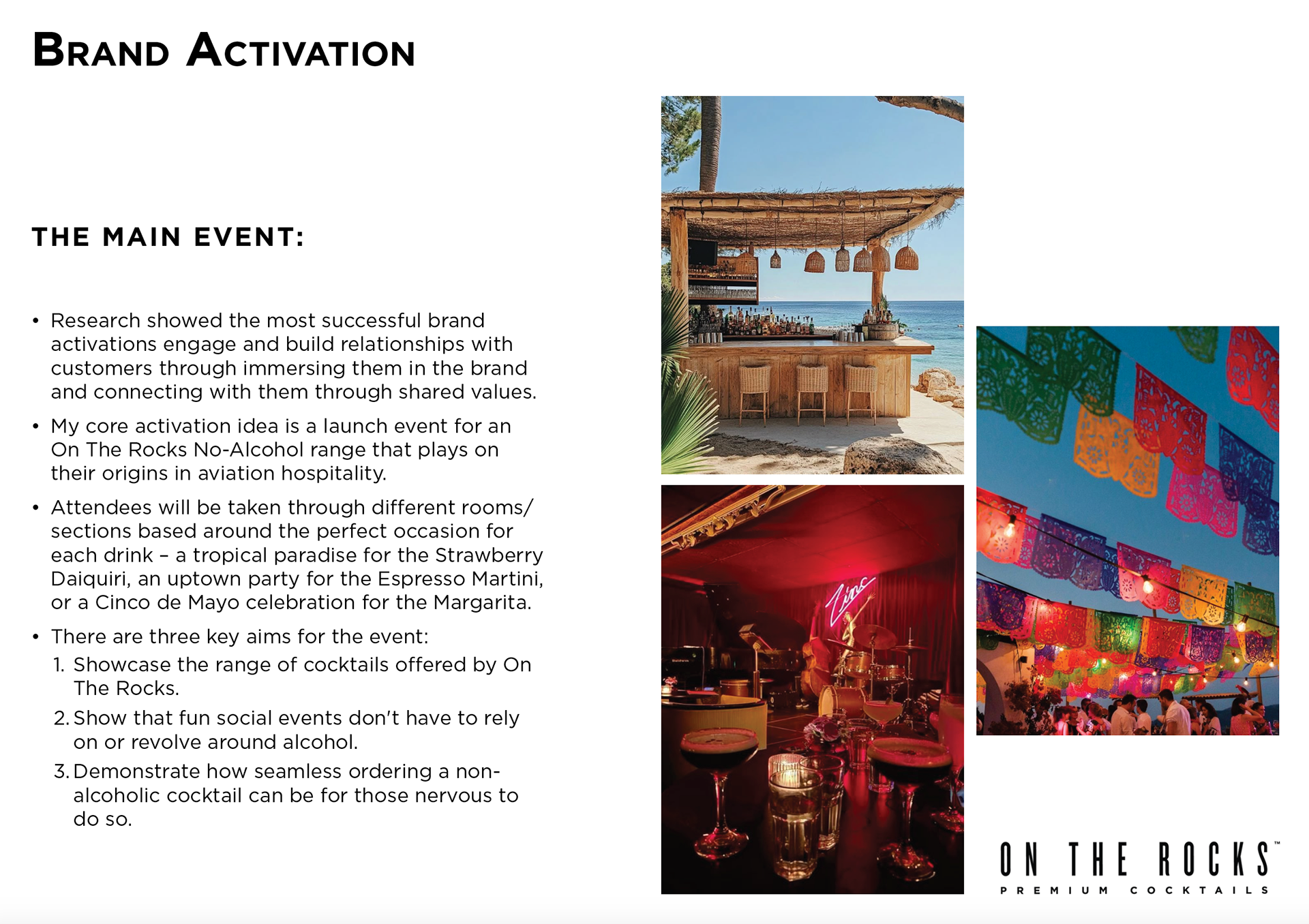
You must also create brand activations that are either physical experience or digital. It should expand the acceptance of the brand to appeal to a younger demographic, as well as be exciting and engaging, creating a big splash across the drinks industry.
WIP Presentation Slides
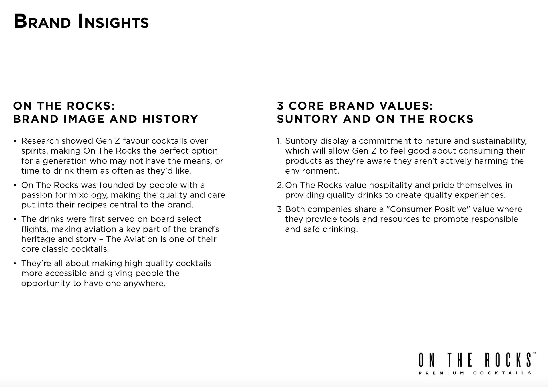
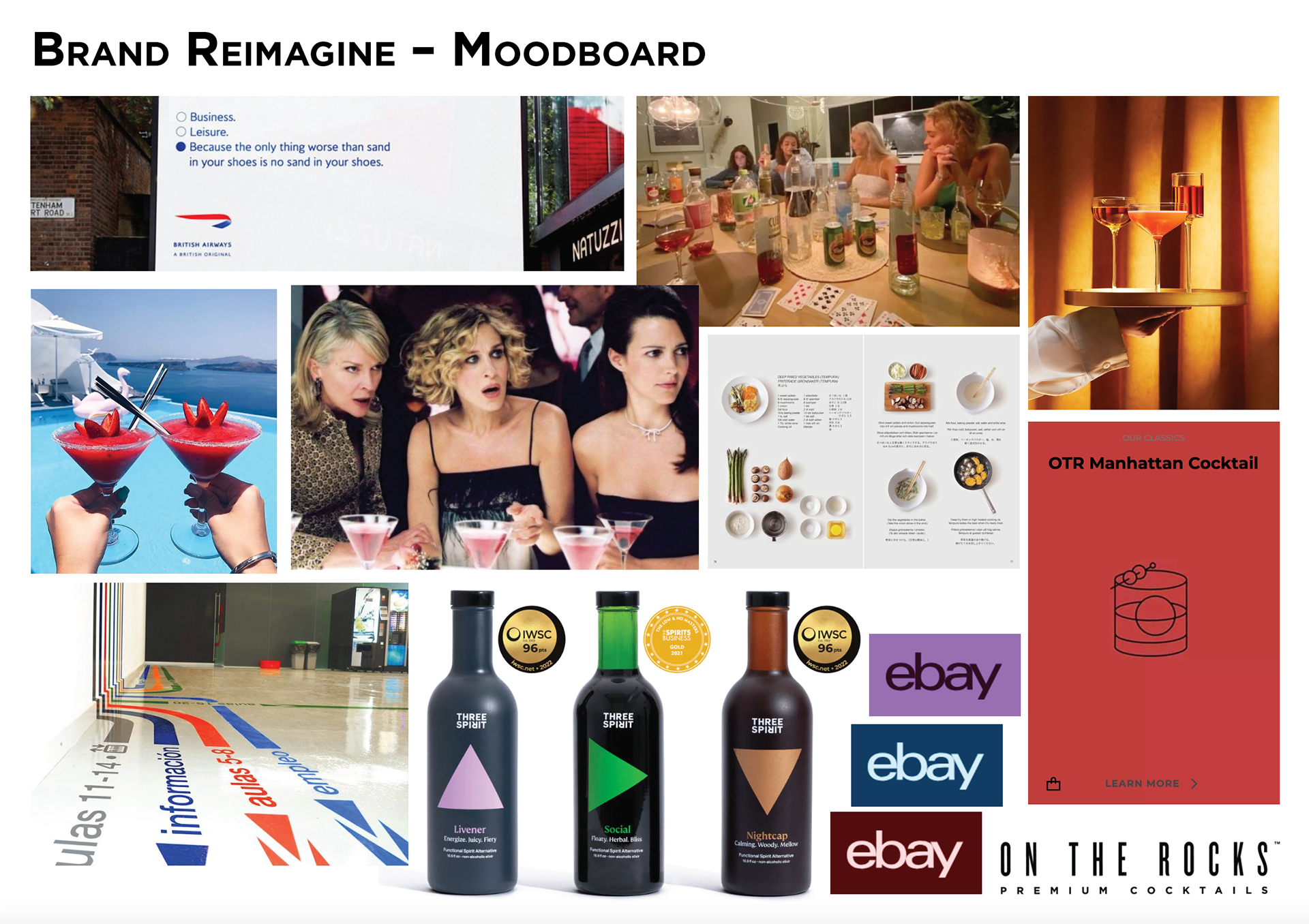
After extensive research into the brand options, the drinks industry, drinking habits, and successful branding and brand activations, I chose On The Rocks as the brand for my project.
Below is a short series of presentation slides I quickly created to summarise my research, visual references, and my big idea.
Reimagined Brand Identity
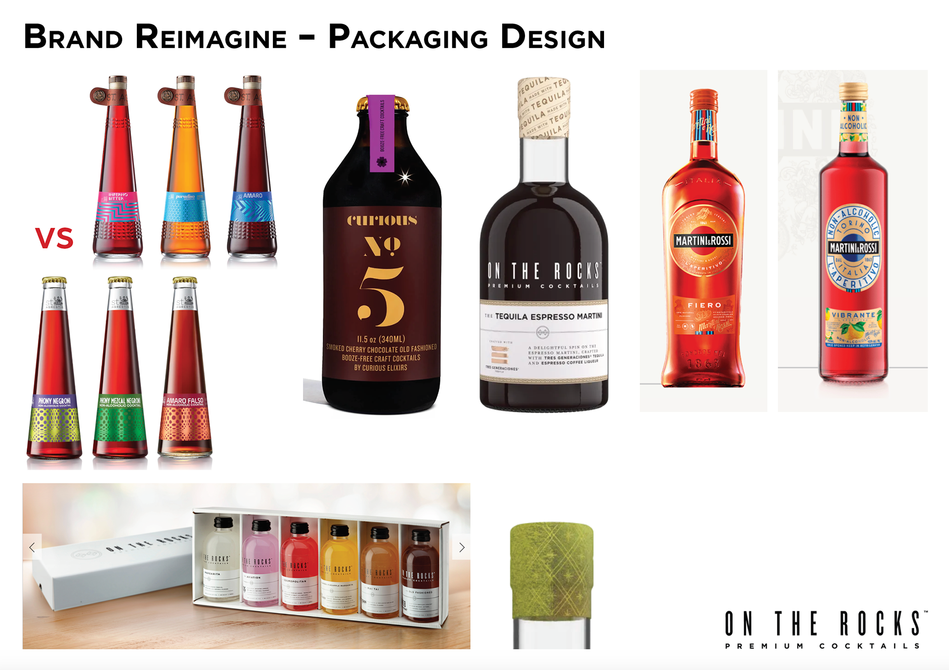
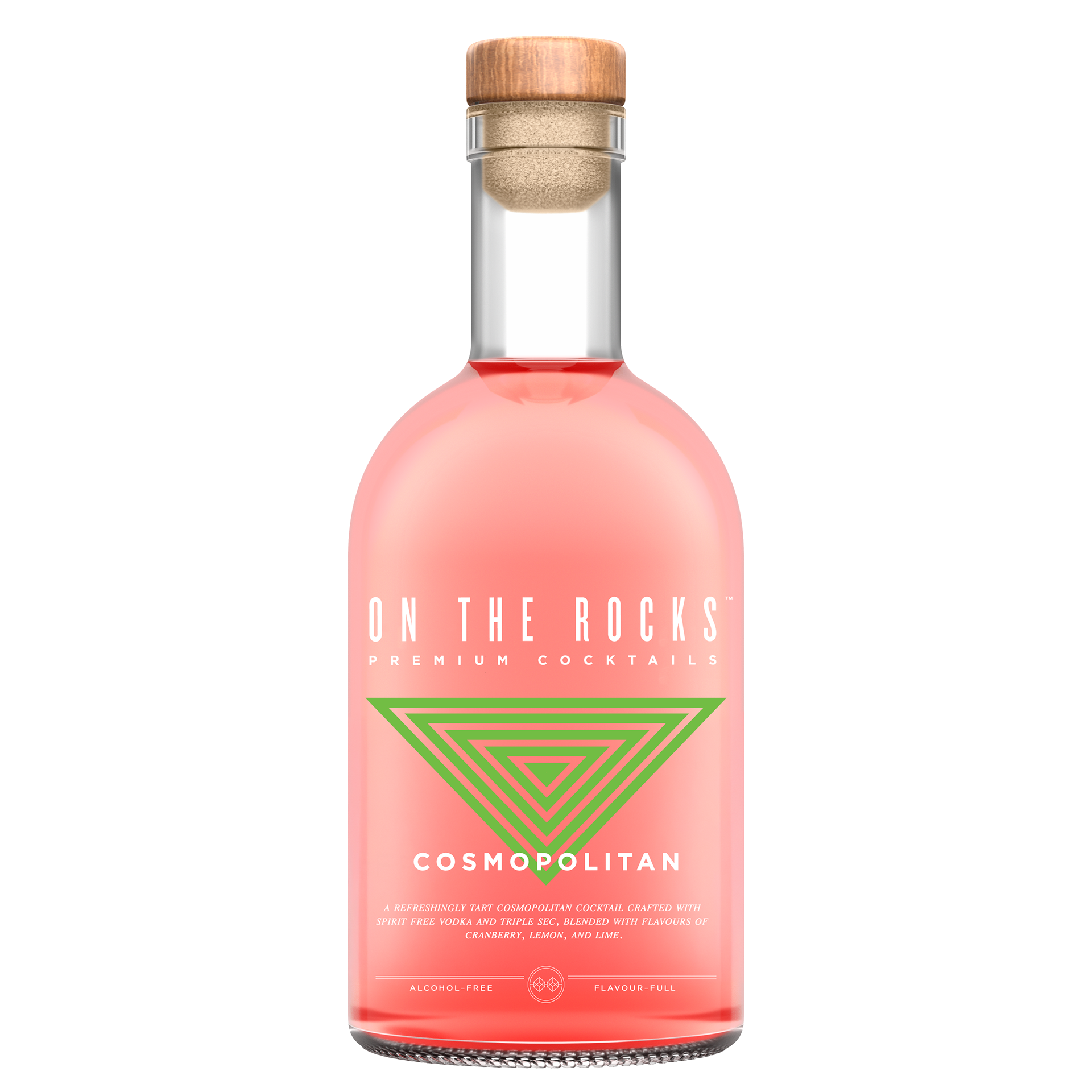
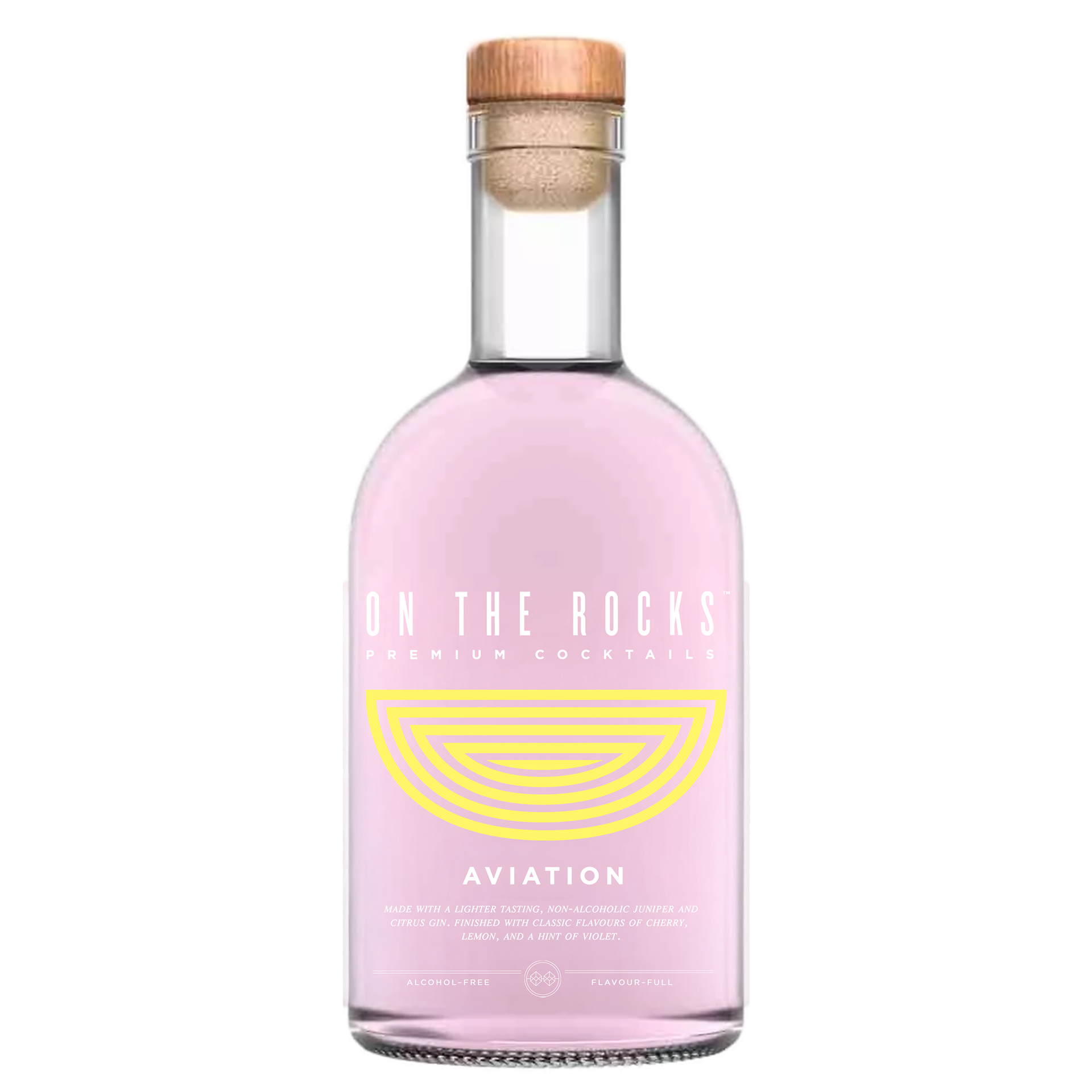
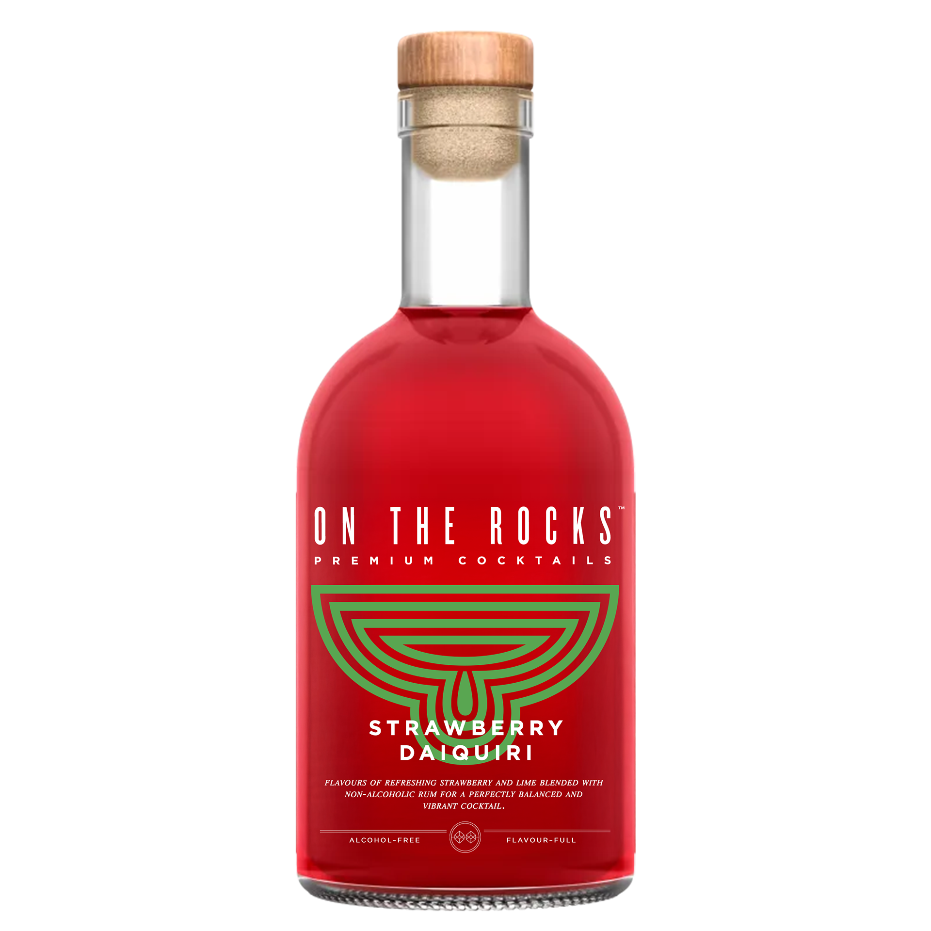
After solidifying the brand activation event as my end goal for this project, I knew my next step was figuring out the reimagined branding for On The Rocks' non-alcoholic range.
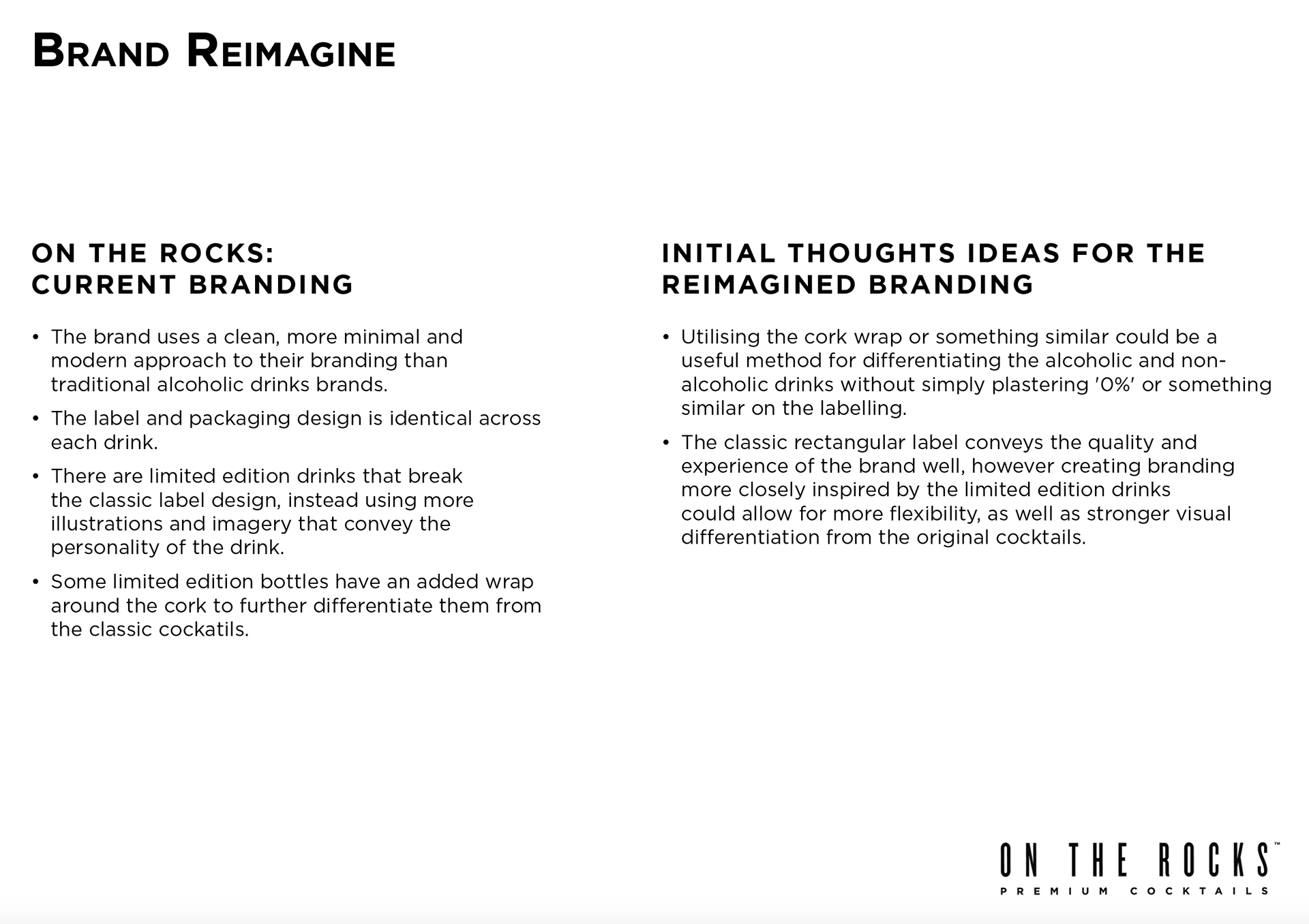
I went through endless approaches and design iterations before reaching this identity, struggling to create something new and fresh from the original branding that still honoured it.
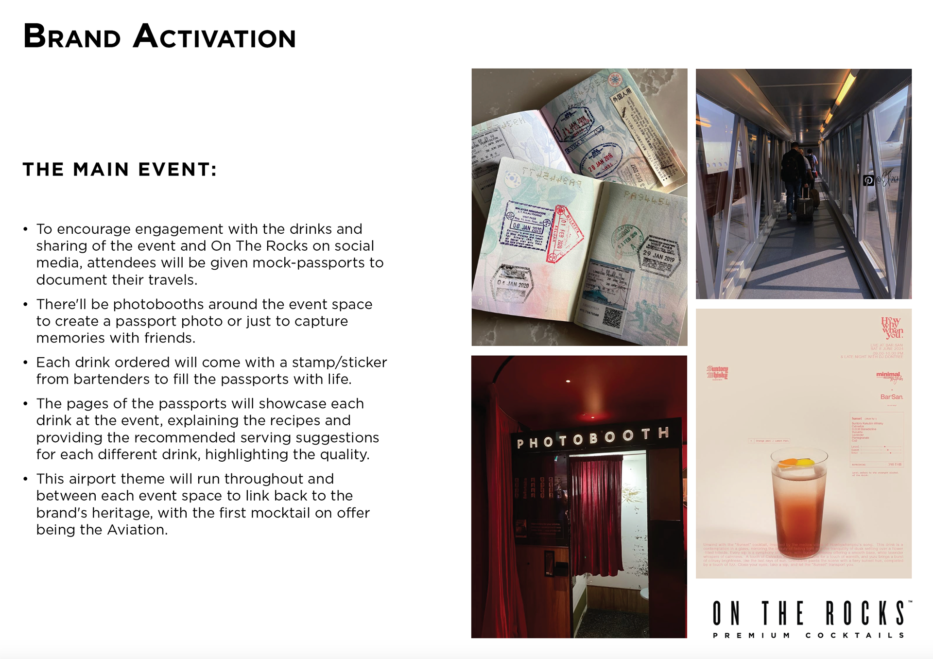
When looking over some original reference images I had found, I took note of the line designs used for public transport and travel – the ones on the floor of an airport to direct you and the iconic lines of the London Underground map, all in a very similar design style. I already had an idea to utilise these in the event design to give fun directions to attendees and elevate that feeling of being transported to a new place, but realised it could work to use them in the branding too.
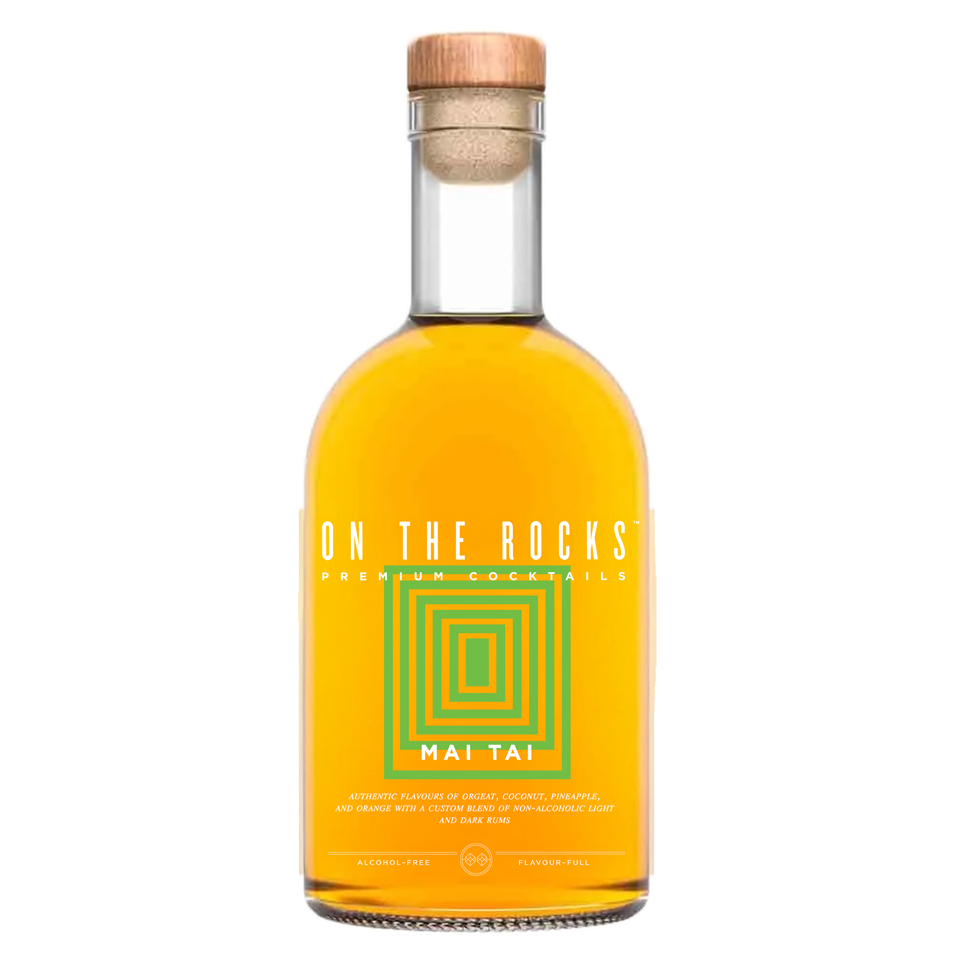
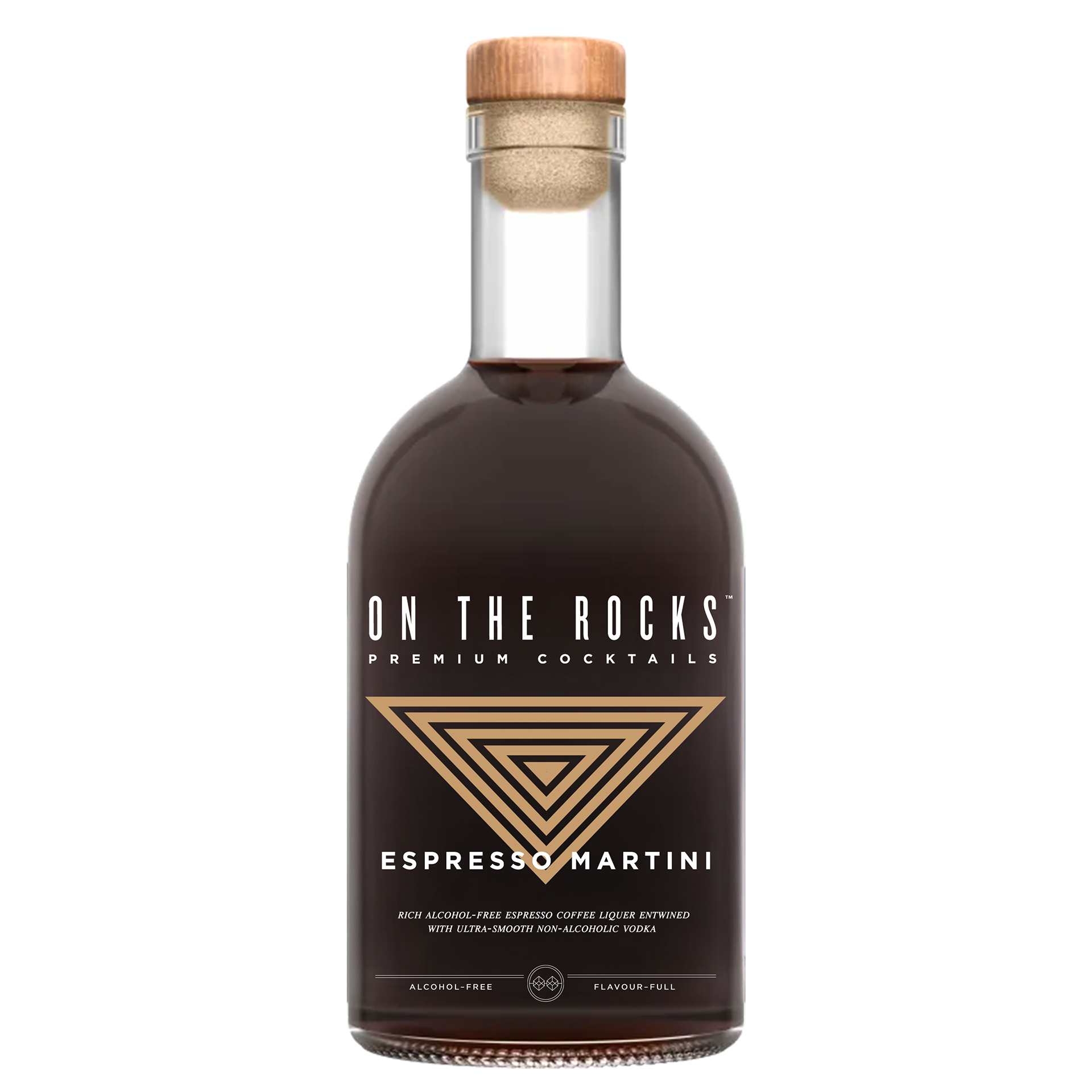
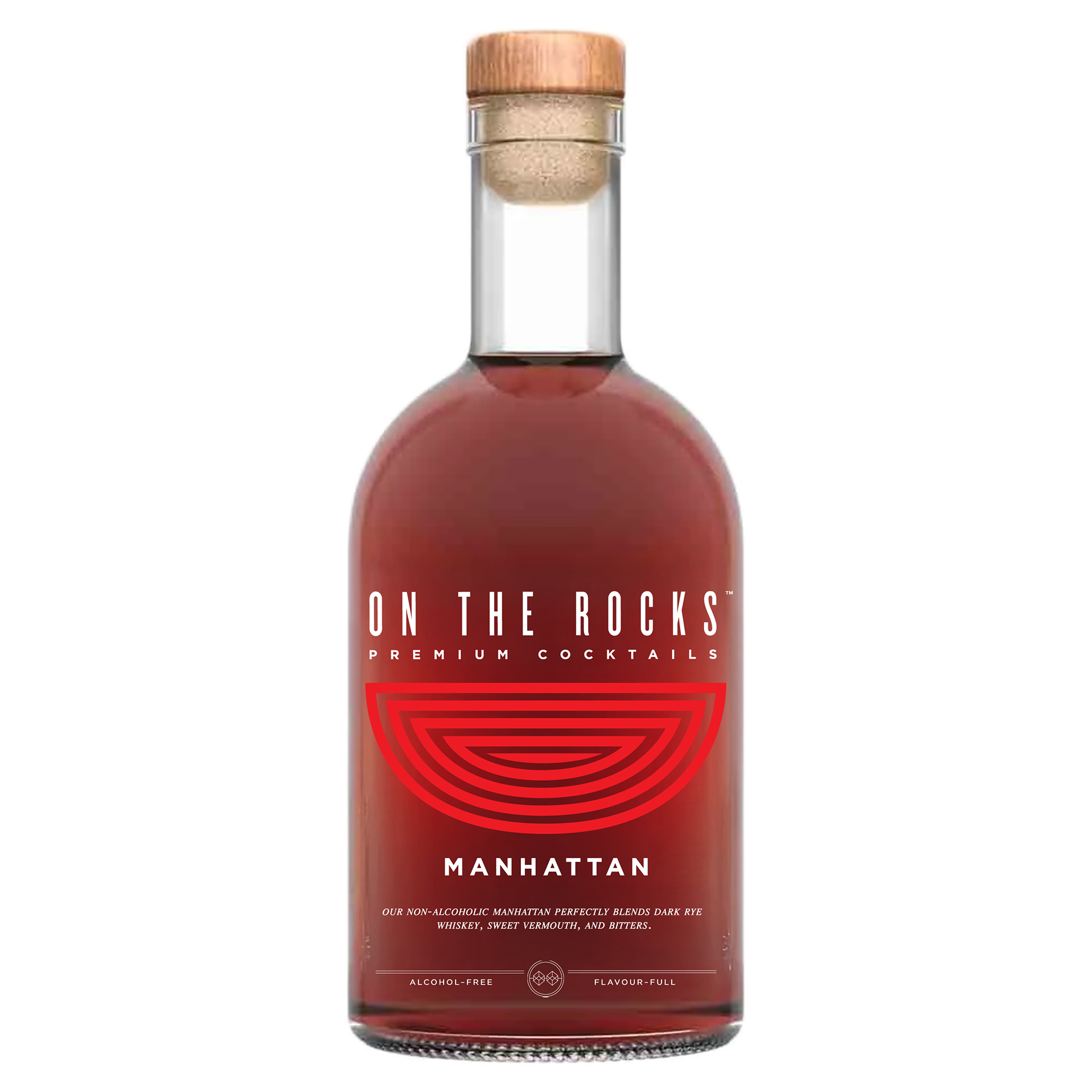
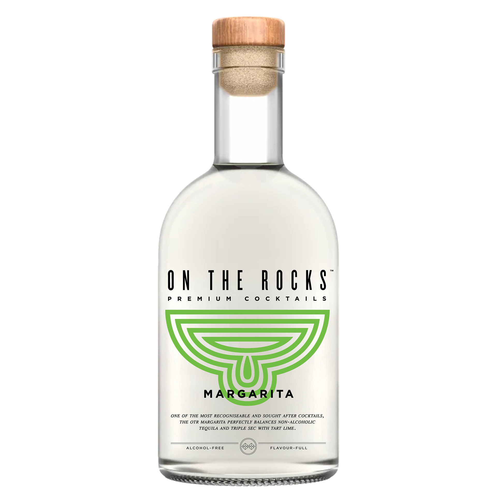
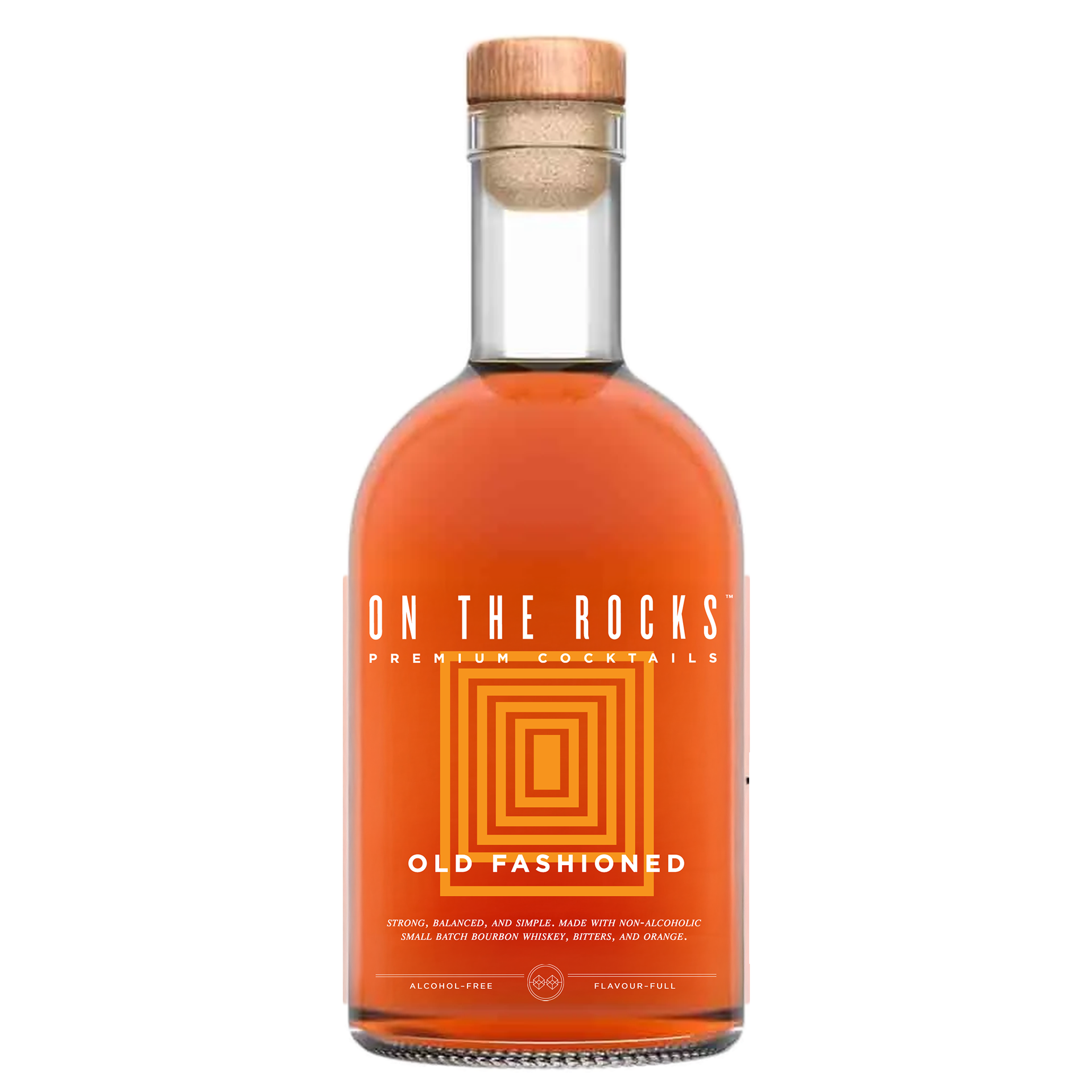
OTR's commitment to high quality cocktails and experiences was also on my mind throughout this, thinking about how even the glassware used can elevate the experience. This then gave me the idea for a visual system for the branding – each bottle having the shape of the recommended or most popular glassware for it on the bottle.
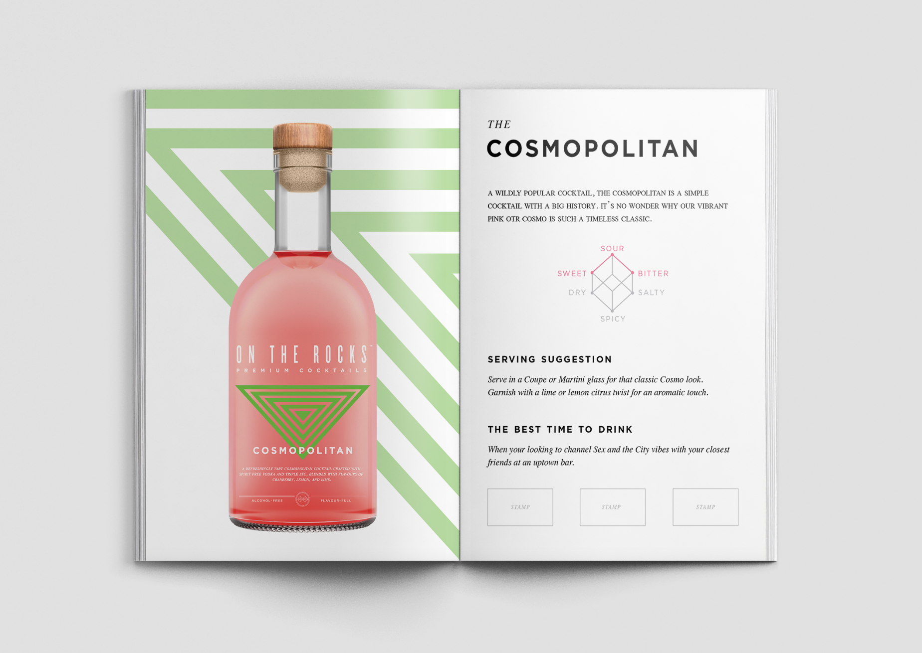
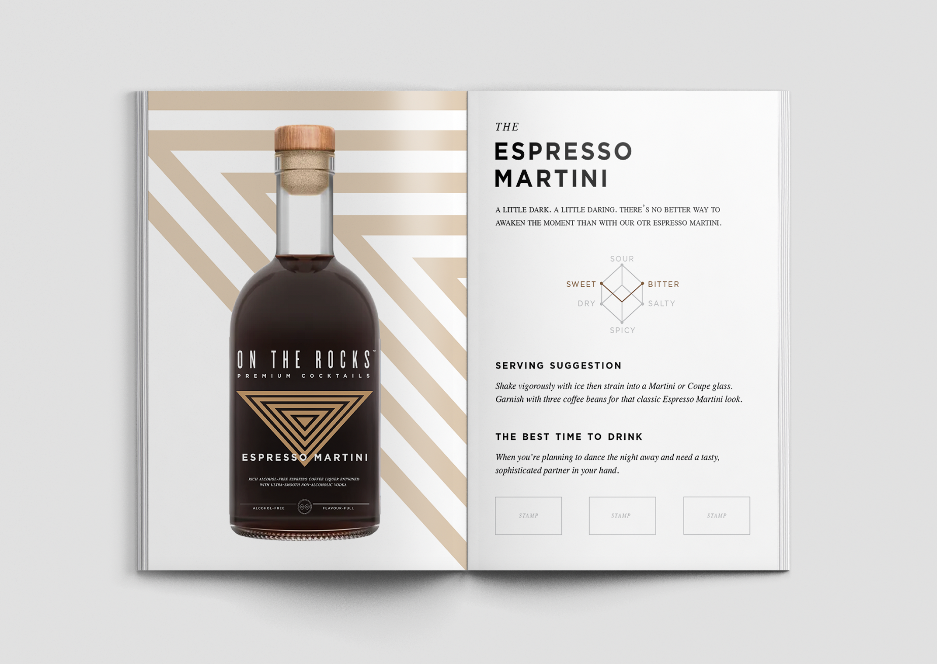
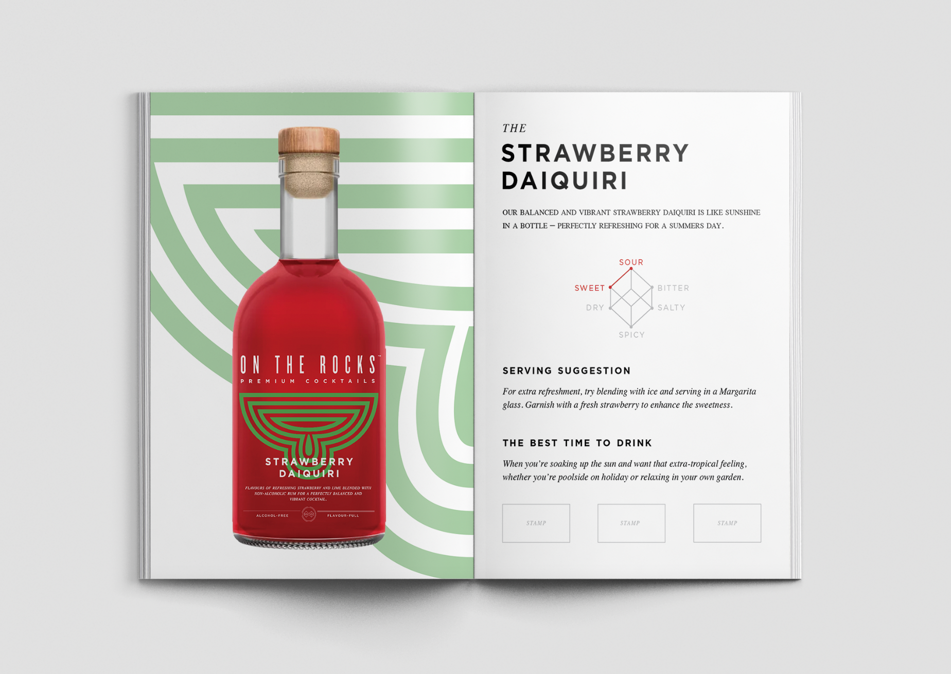
This, combined with the line designs, is how I reached the reimagined brand identity on the bottles below. The colours used on each bottle directly correlate with a suggested garnish or key characteristics of the drinks.
Brand Activation
Now that I had a solidified identity and visual system, the next step was to start creating the deliverables and assets for my event idea – this is the stage I'm currently working on.
Below are the current page designs I have for the passport menus, giving further information about each drink whilst introducing the visual system on each page to ensure brand consistency. I'm happy with the layout and design of them at the moment, but will likely continue to tweak them to make them more passport-like. I'm also currently working on designing an 'intro' page for them that includes the more traditional passport elements of a photo (from the photobooth), space to fill out the attendees info, and a mini map of the event.
Next Steps
When I initially came up with my idea for the brand activation, I naively assumed I'd be able to find substantial enough mock-ups to convey my idea and vision. However, I've realised this may not be the case, so I have now decided to use this as an opportunity to expand my technical skillset and venture into using Adobe dimension.
My aim is so create strong enough mockups that show the overall layout of the event from above, the photobooth, and some of the destination bars available, as well as detailing of the branding applied throughout the space, such as wayfinding lines on the floor and further photo opportunities.
I'm also aware that, since starting this project, ORT have begun rolling out new branding on some of their packaging. However, I've decided to keep my designs within the original branding as I feel it suits the high quality product and experience they align with.