Talking Point
UX/UI Design and App Creation
Brief
The brief was to design and produce a digital product or service through undertaking a vigorous User Experience Design approach to a stated problem. The final outcome of this would be in the form of a high-fidelity prototype created using Figma.
Our given problem was to explore, research, and develop an innovative and engaging way to meet people with similar interests at university.
We had to carry out UX research, which included interviewing students and creating empathy maps, user personas, and user journeys. We also had to carry out the UI and visual design, creating a set of brand/design guidelines for the final product.
The final requirement for the brief was to have two different user goals that our high-fidelity prototypes were linked for - this meant that our products could have buttons that represented the product's potential but didn't actually work, either due to being outside of the user goals or too complicated to make work using Figma.
Insights
Through carrying out rigorous research, I noticed that some students don't manage to actually get to know the new city they're living in when they move to university.
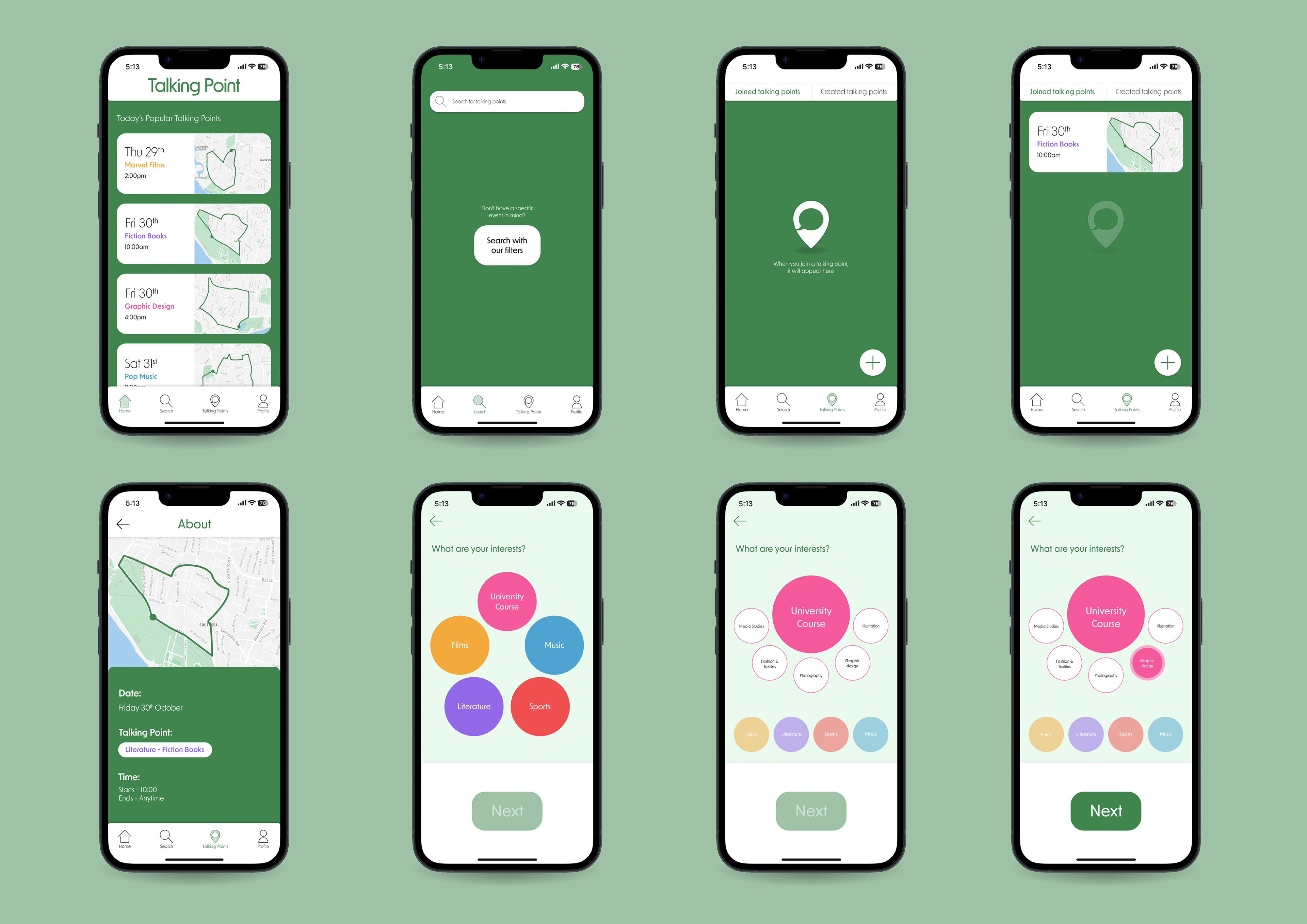
From this, I came up with the idea for Talking Point - an app where people join walks, or "talking points", around their city with pre-planned routes based on the topic that will be discussed on that walk. For example, people who listen to Taylor Swift, or people who like indie films, can all meet up and get to know a new city together whilst talking about their favourite topic.
An additional benefit to Talking Point is it gets students out of their flats. With some universities providing online learning options still, it can be easy for students to go out during the day less and less. Talking Point tries to fight this by encouraging students to not only go outside, but also get some gentle exercise by walking around their city.
User Personas
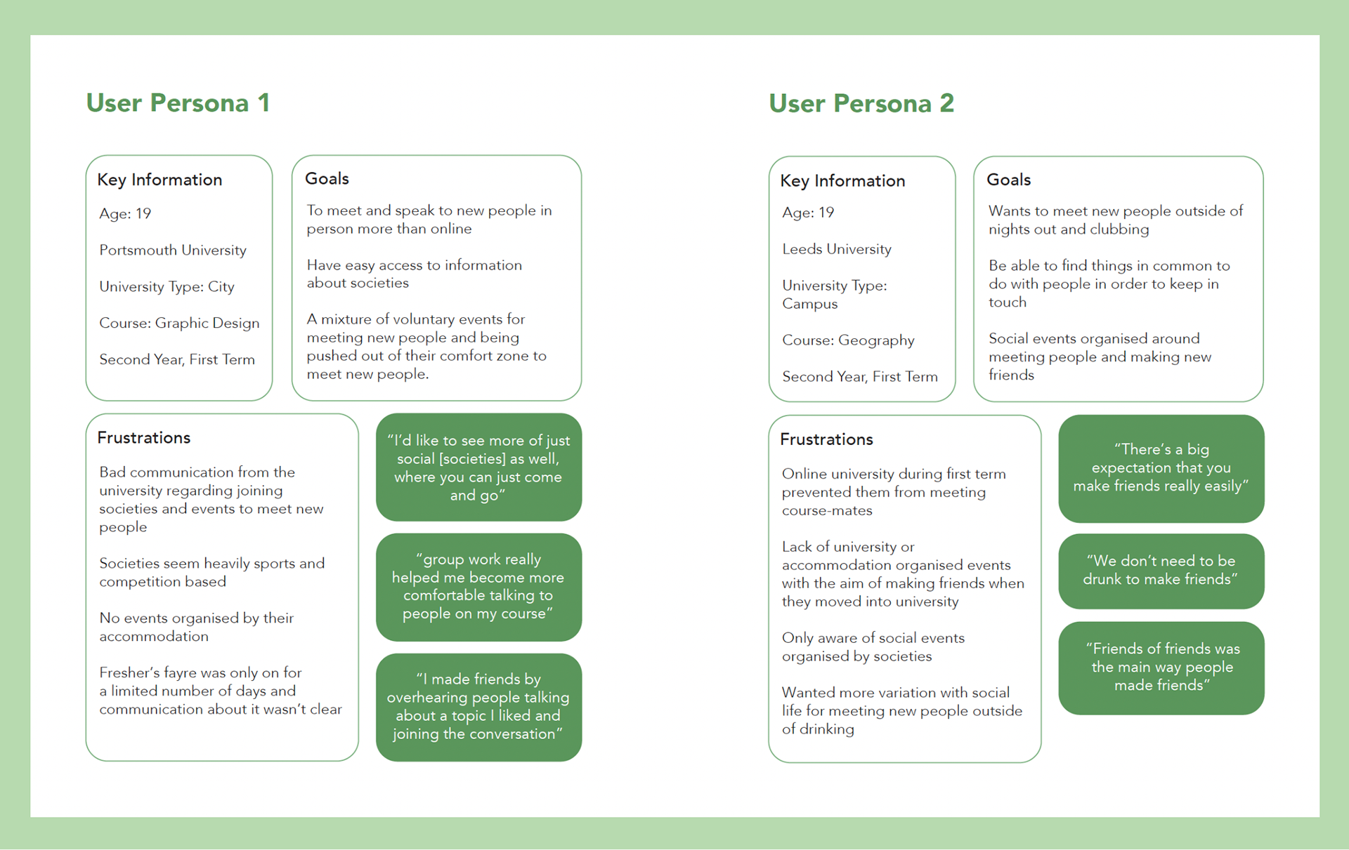
The two user personas created from interviews.
Brand Guidelines
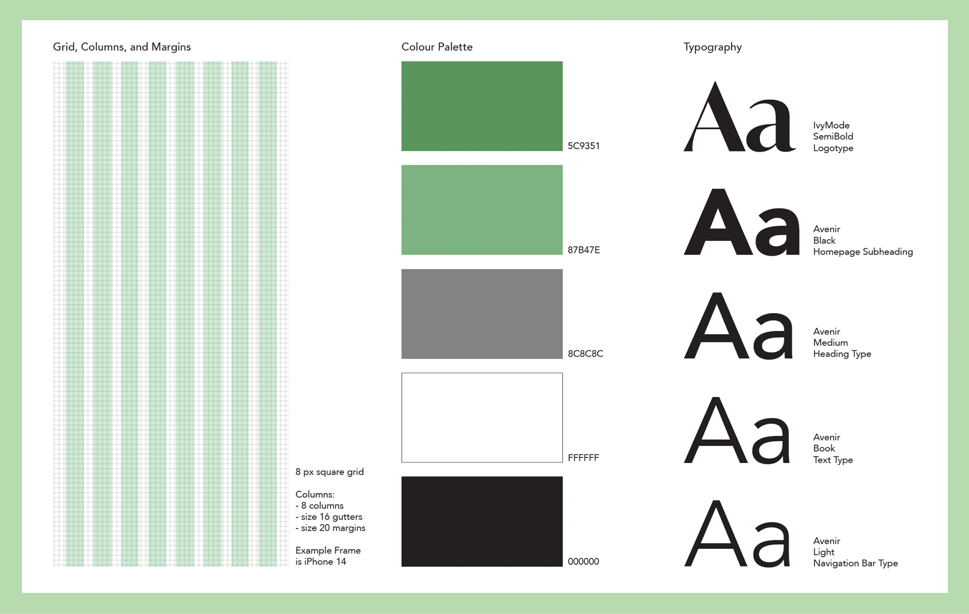
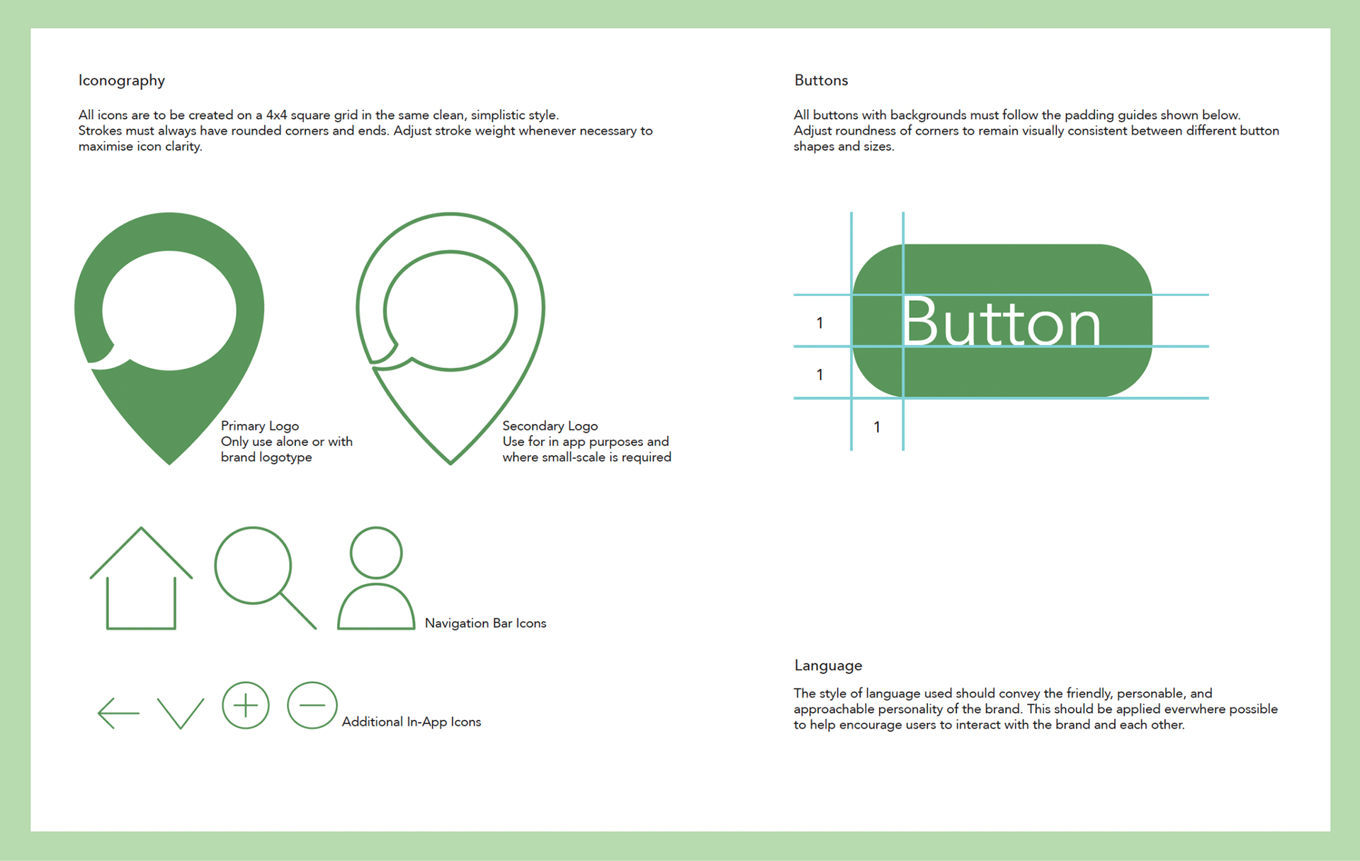
For the brand guidelines, I wanted to make sure they covered both the basic building blocks of the UI design, such as the grids used for the pages and icons, as well as the rules for when to use the logo and what kind of language to be used.
I chose green to be the accent colour of the colour palette to relate the visual design to the idea of spending time walking around outside, and kept a clean and simple design style so to not overwhelm the user and help them to feel calm during a time where they might feel anxious about living somewhere new.
User Goals
The two user goals I decided on for my product were:
1) Using the search by filters function, join a Talking Point for your University course on a Sunday between 10am and 4pm.
2) Create your own Talking Point for your course on a Monday at 1pm.
These two user goals were chosen as they best display the main functions of the app - students are able to join Talking Points or create their own if none currently suit their interests and availability.
Below are videos showing these two user goals being completed.
UI Visuals Redesign
One piece of feedback I received on this project was that I could have experimented with the colours used more, rather than have so much of the product have a white background. This was something I wished I had more time to do before the deadline too, so when I had some spare time, I decided to redesign a few of the screens from my original product. My aim was to make the product look more interesting to the user and flesh out the design of the components more, so it looked lees like a prototype overall.