Refashioning Ribbons – The Start
Campaign Design
Brief
My randomly generated, one line brief from Design Bridge & Partners' Brandomiser was 'How can Jo Malone take on fast fashion to appeal to a career driven millennial?'
Insights
There was one main problem to solve that I first noticed with this brief: how does a cosmetics brand tackle fast fashion? I dove into Jo Malone's values and visuals to find a connection between the two, and their Packaging Promise immediately stood out to me. Not only do they design their packaging with sustainability and recyclability in mind, but they also encourage customers to reuse their wrapping materials, including their iconic ribbons.
Here, I was reminded of huge popularity of accessorising with ribbons in 2023/24, and realised I'd found a key connection between Jo Malone and fast fashion. During my research into Jo Malone, I took note of the Botanical Monogramming service they were hosting for Mother's Day, and this gave me the perfect idea of how ribbons could be the solution to this brief.
Solution
The Idea
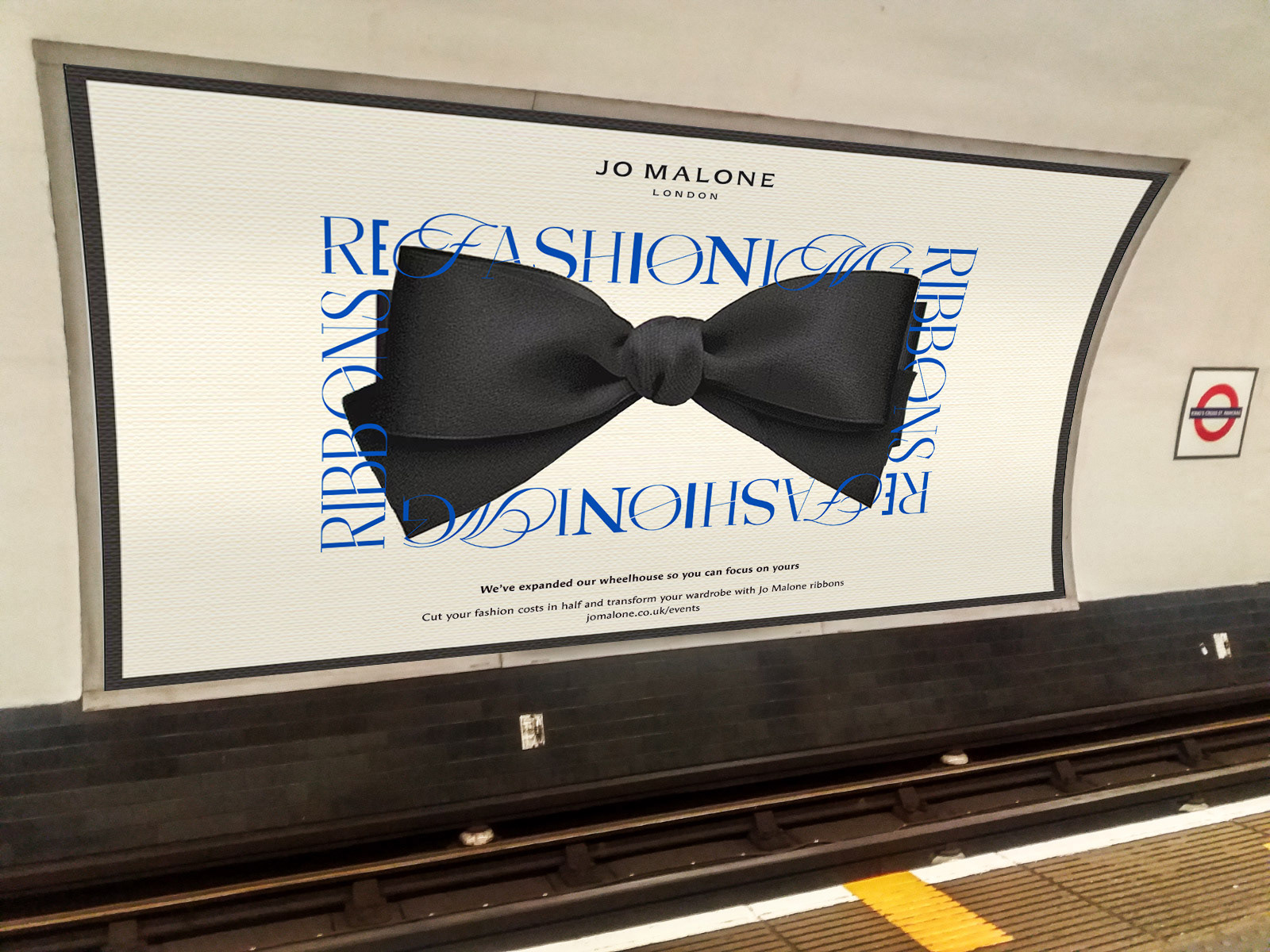
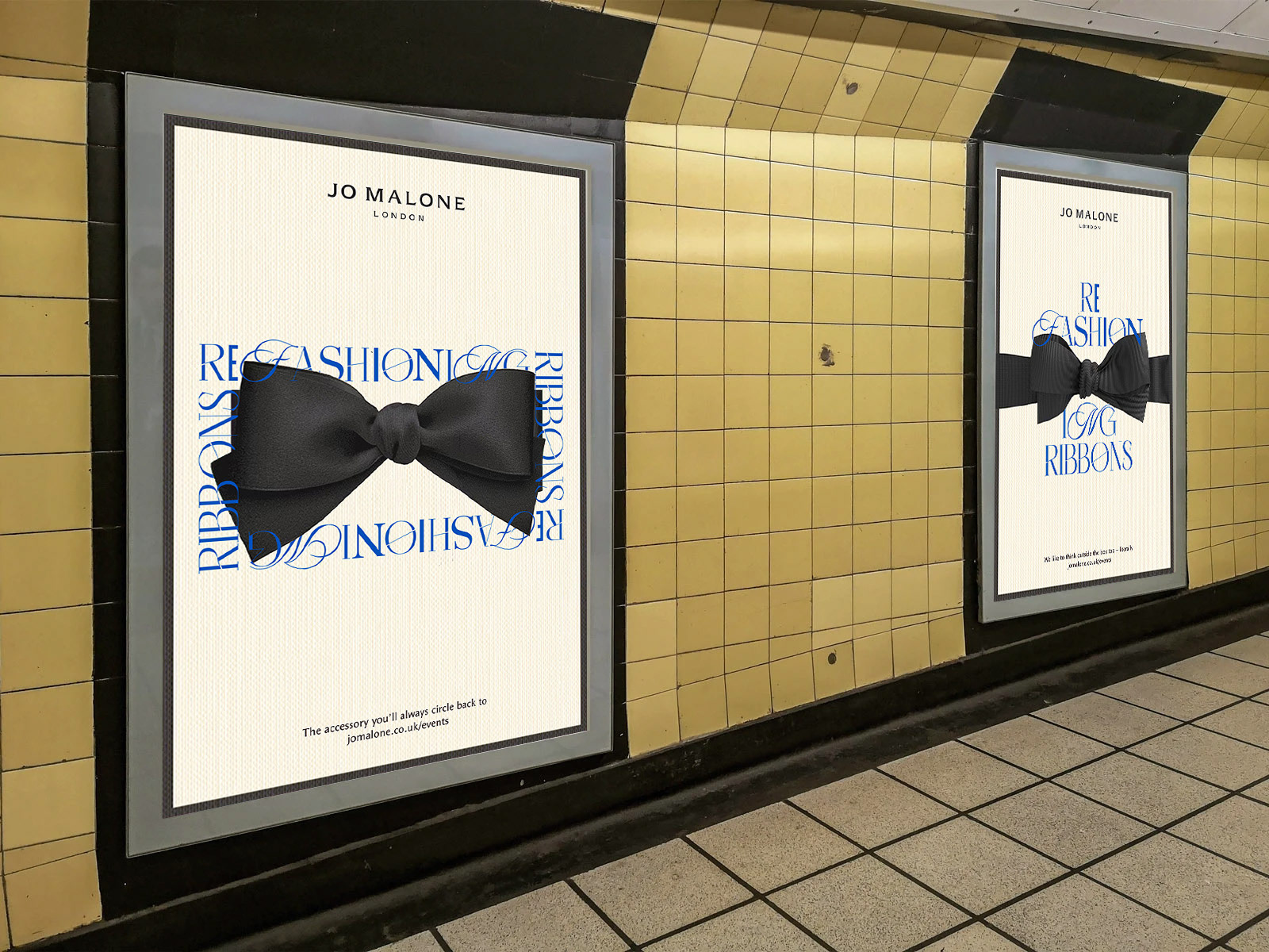
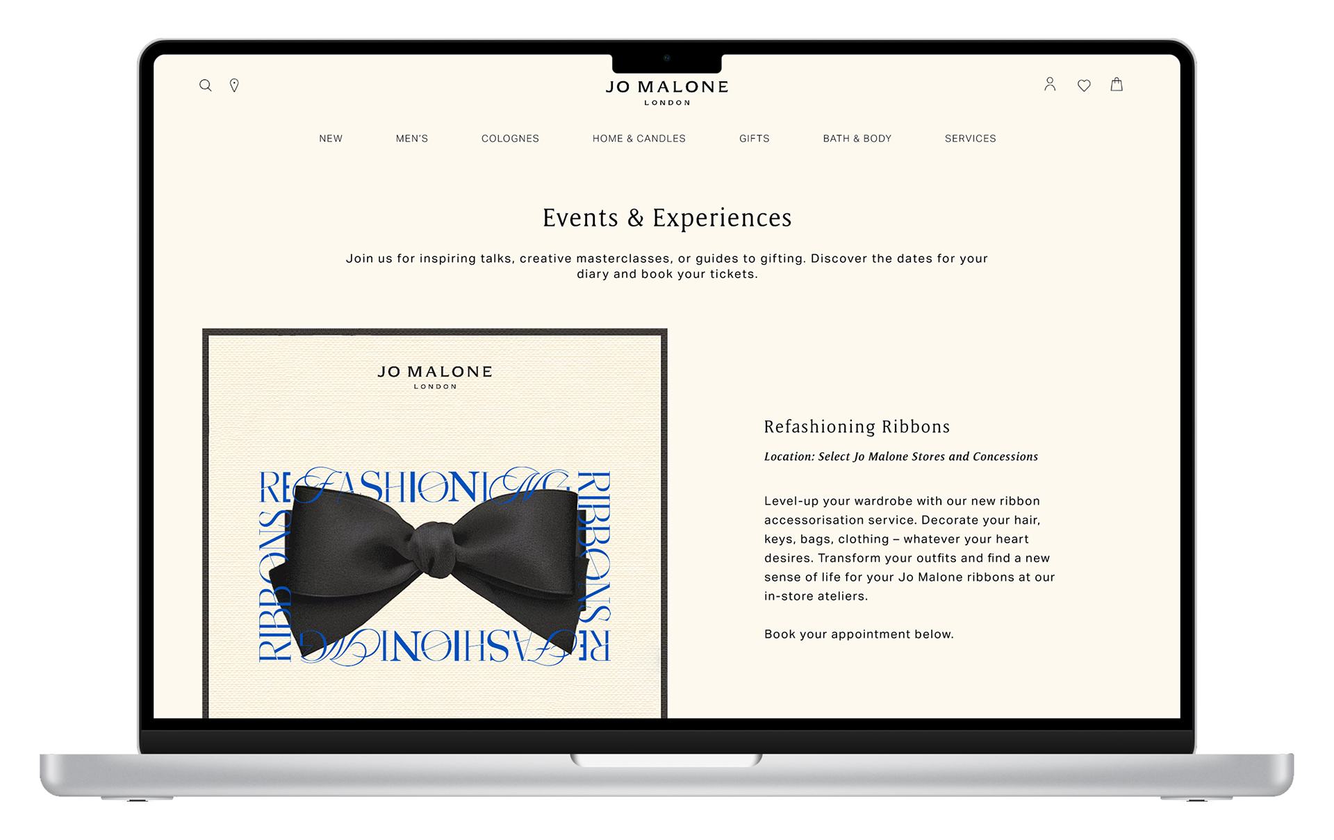
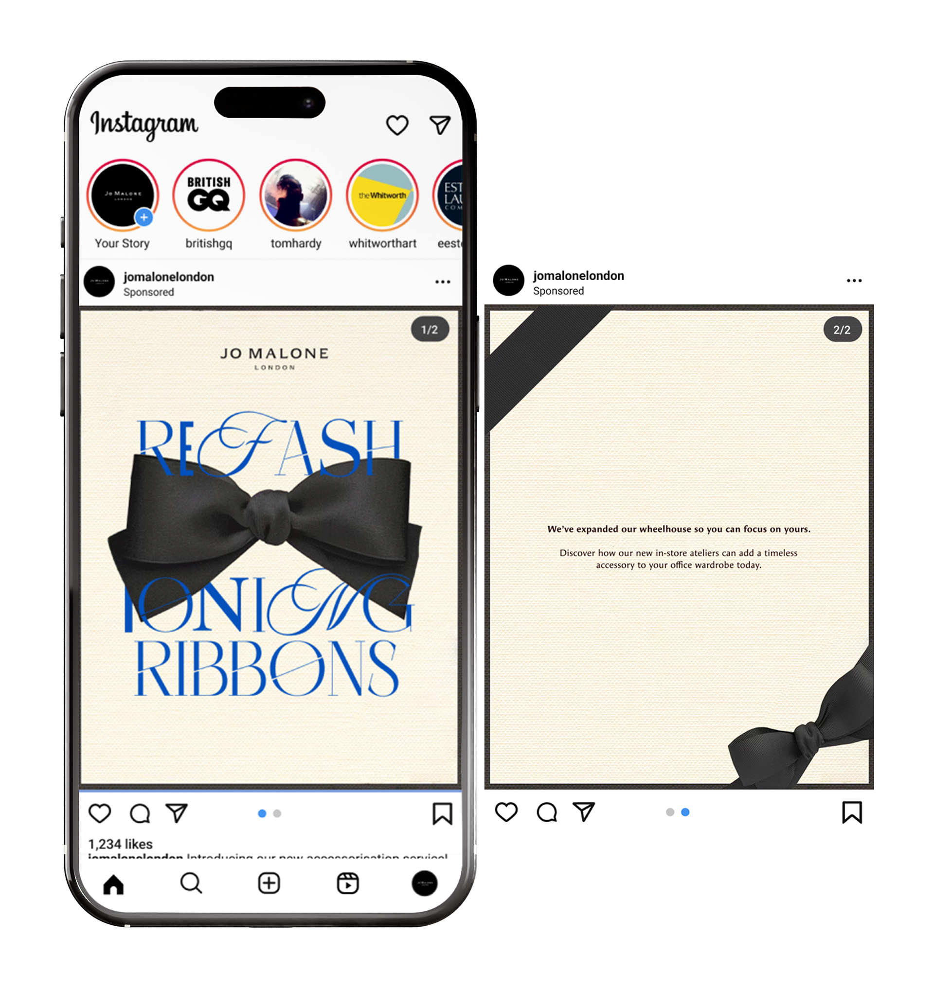
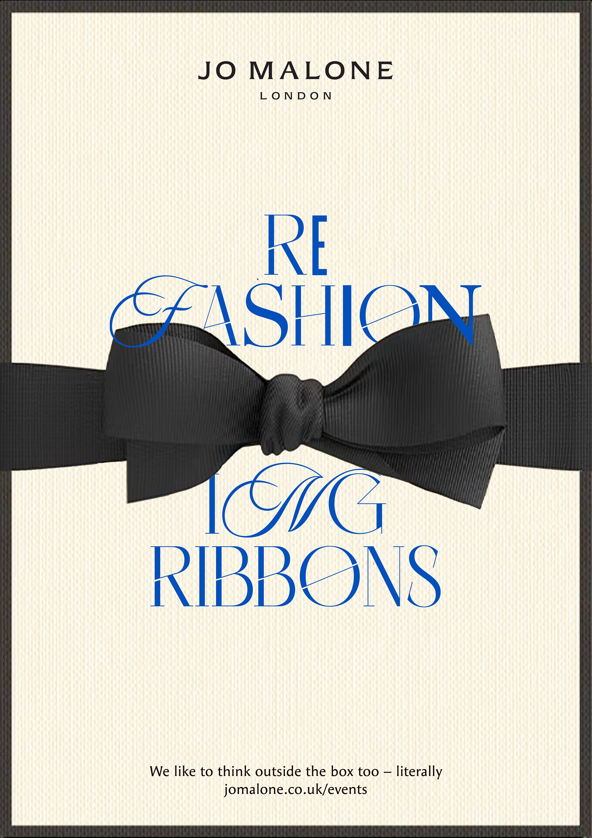
Refashioning Ribbons: an in-store accessorising service that can transform the ribbons from Jo Malone packaging into any accessory or clothing detail your heart desires.
This idea is rooted in breaking the cycle of fast fashion and instead encouraging people to rewear their clothes for longer. Refashioning Ribbons highlights how an accessory can change an outfit and how ribbons can be used to refresh your wardrobe instead of buying a whole new one.
The Application
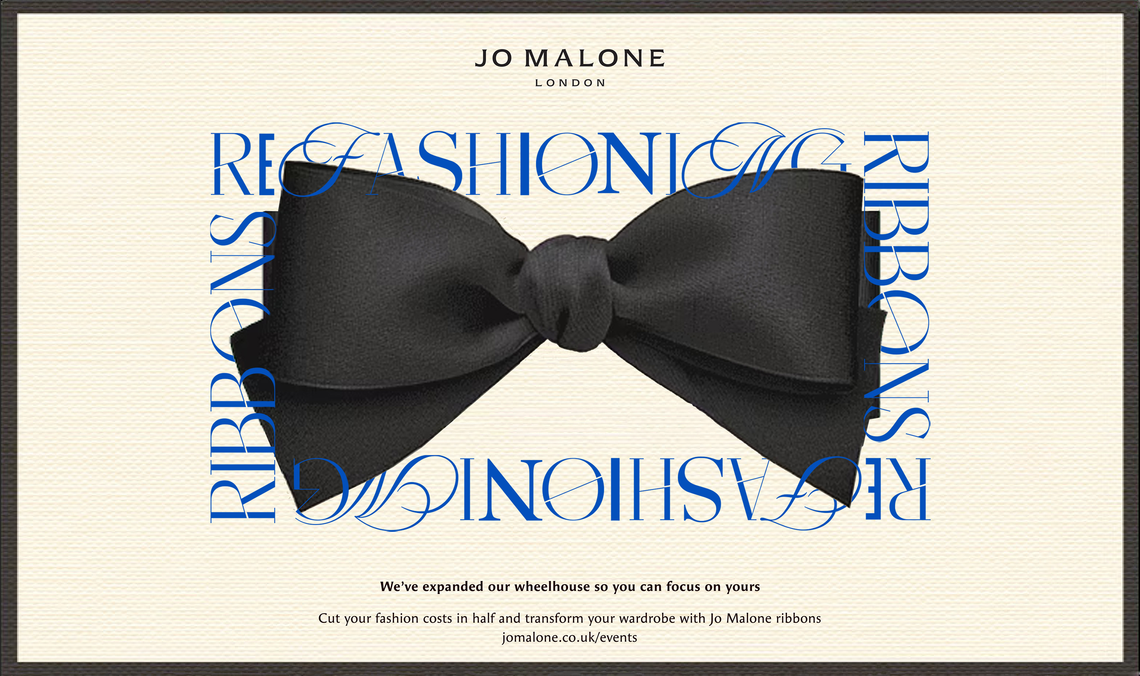
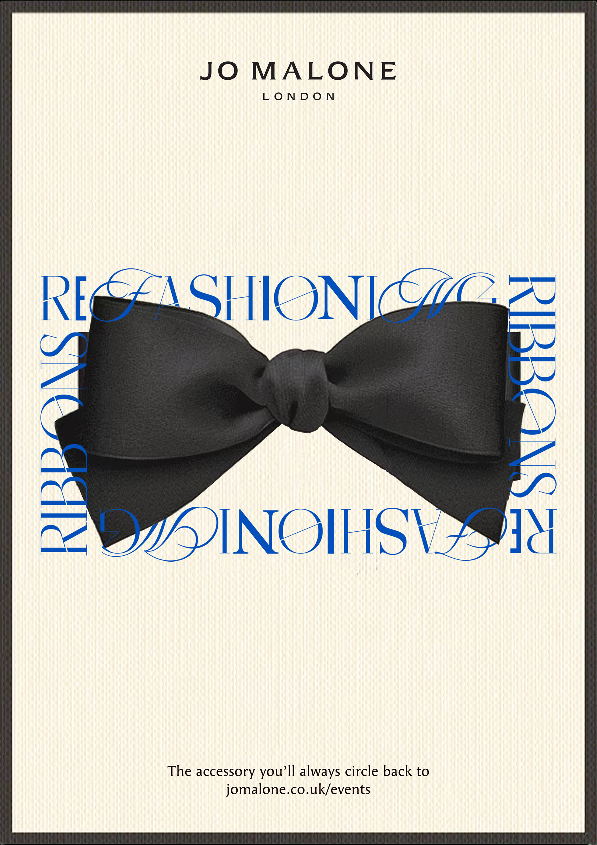
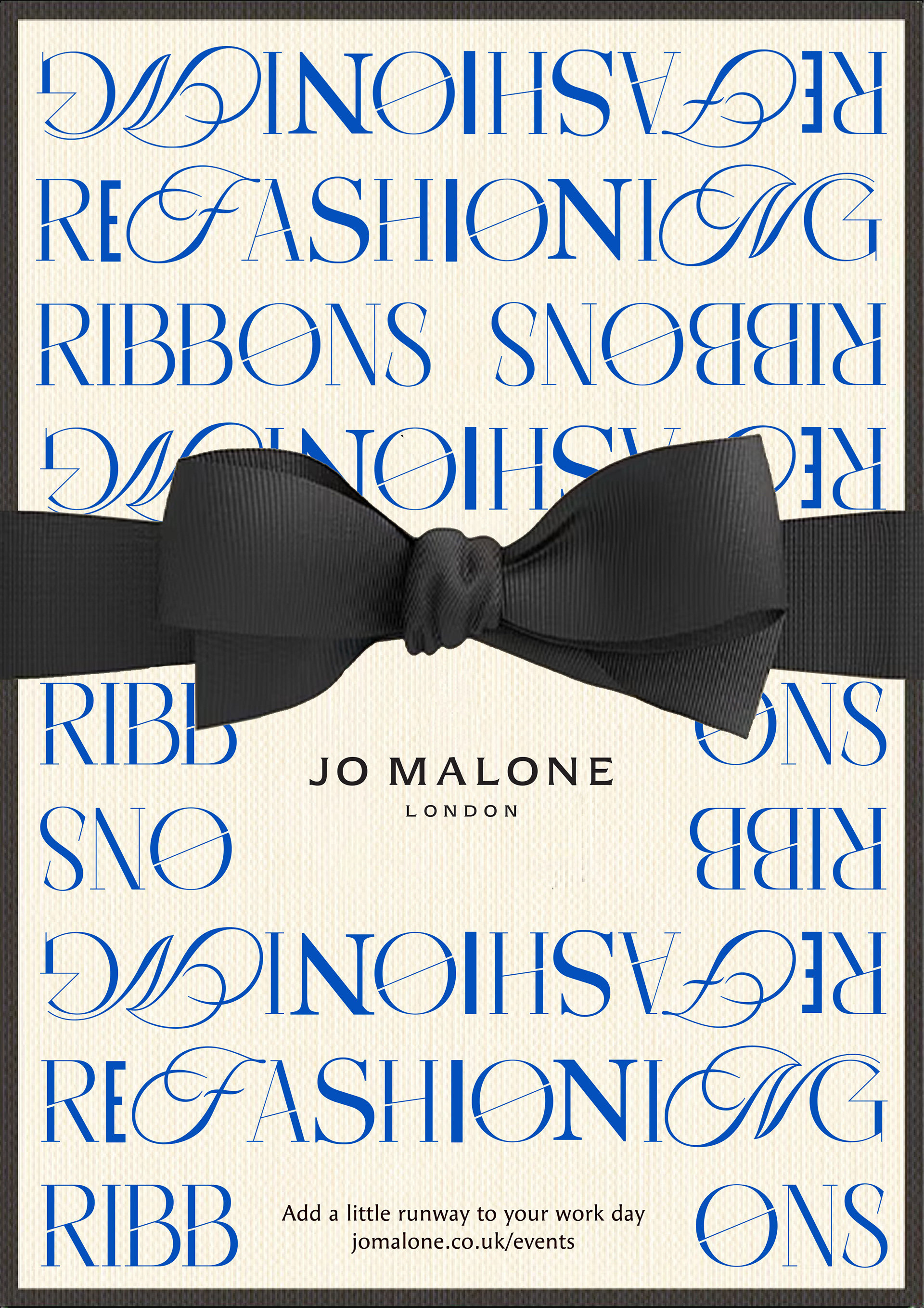
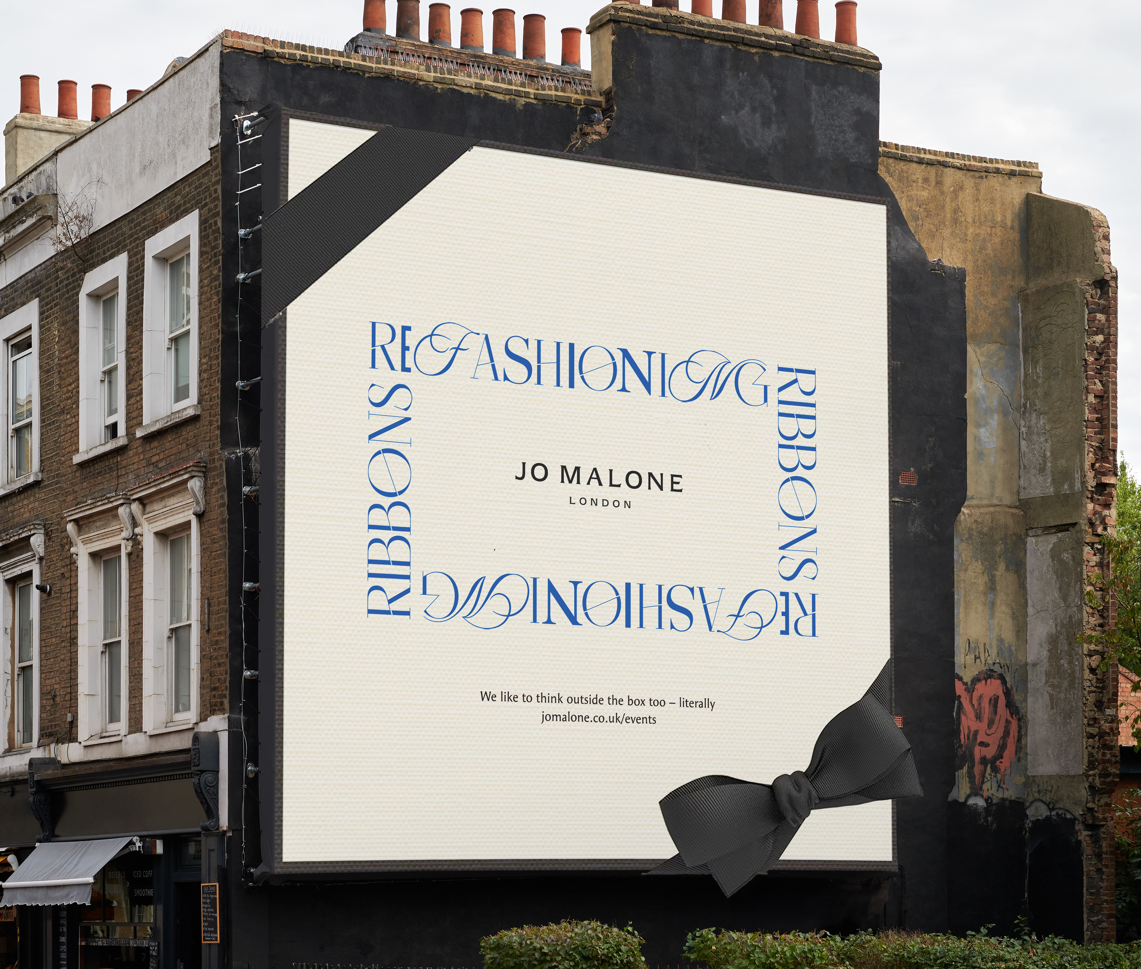
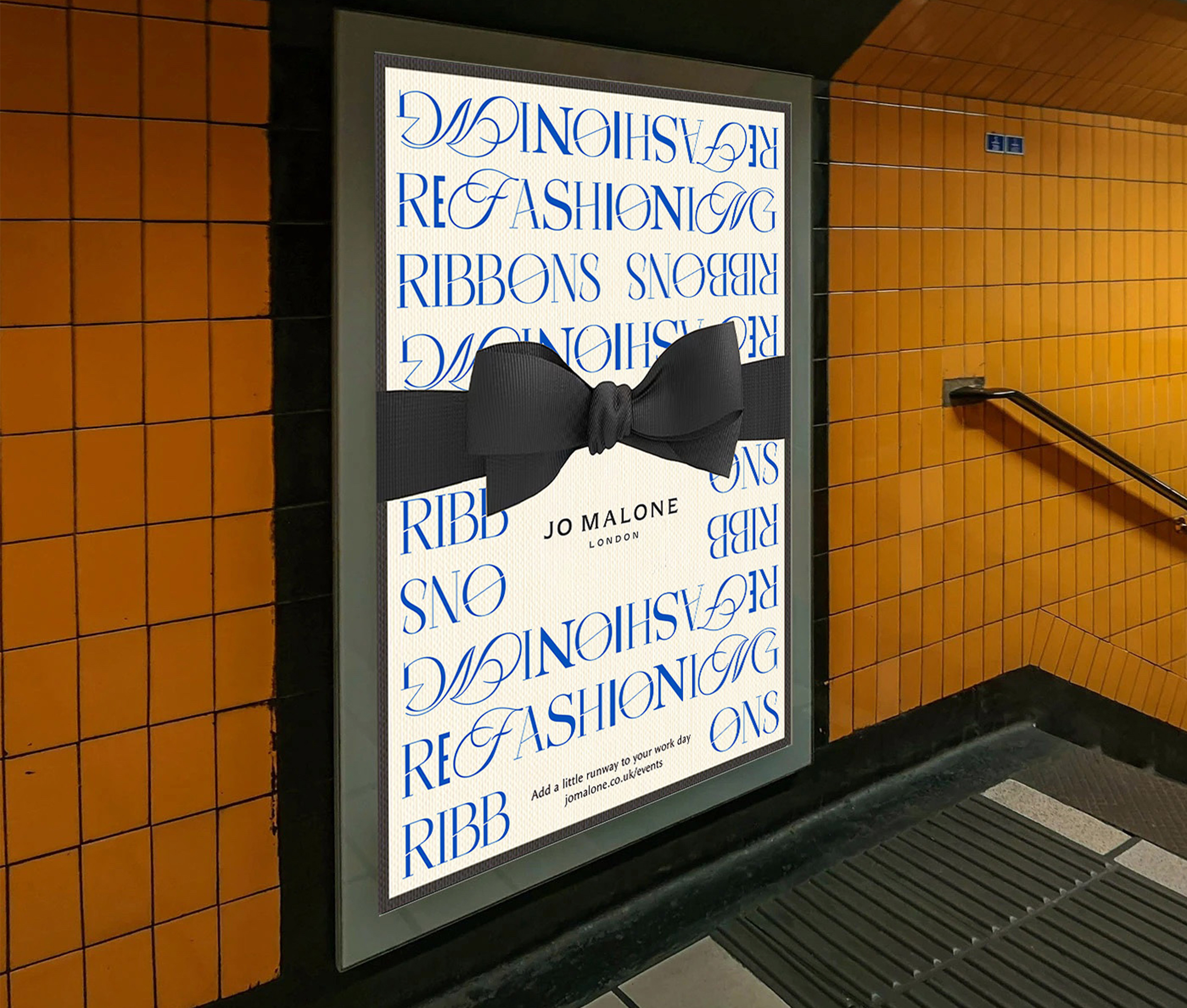
To visualise and spread the word of this new service, I created a series of campaign deliverables in locations and on platforms with a high number of career driven millennials. I wanted to keep as closely to Jo Malone's iconic branding when designing these, highlighting the packaging at the centre of this service.
However, I also wanted to bridge the gap between Jo Malone and the fashion industry with these designs, so created a typographic mark to add a new visual branch to the company. The multi-typeface design was intentionally created to mirror all the different ways customers could wear their ribbons, and the core typeface, Cisnero, was chosen because it shares visual qualities with classic fashion house fonts yet has these sharp, stitch-like lines through the lettering that brings us back to the handmade quality of the Refashioning Ribbons service.
The Copy
As important as the eye-catching visuals are for this solution, the copywriting is what really brings it all together.
As I was developing this project, I had all these ideas for how fashion and accessories can boost your confidence in the office and subtly let your personality shine through, but I wasn't sure how to incorporate them into my work.
Through some mind-mapping and ideation, I came up with the idea to utilise common corporate language to create a feeling of understanding between Jo Malone and career driven millennials, allowing them to relate to and be seen by the brand more.
"The accessory you'll always circle back to"
"We like to think outside the box too – literally"
"We've expanded our wheelhouse so you can focus on yours"
These taglines became the heart of the campaign, highlighting both the importance of cyclical fashion and Jo Malone's role in this with Refashioning Ribbons.