The Vast Collective
Visual Identity and Brand Creation
Brief
As a team, we responded to a fictional client brief asking us to design and present a visual identity for a start-up enterprise. Our client was "a small diverse team of young, proactive, like-minded individuals who have joined together to launch a business that’s built on a shared passion for art, craft, and community". They would be located in, but not restricted to, the Dockyard initiative, Old Portsmouth, in a repurposed shipping container.
The identity needed to represent the client's core values of imagination, inspiration, and inclusion, and be demonstrated in use for print, digital, and the physical space of the shipping container, appealing to the 18-38 year old audience.
The mandatories we had to create were a brand name, a logo and/or logotype, and basic brand guidelines. The minimum deliverables/mockups to be shown were: a business card, letterhead, and compliment slip; the exterior of the shipping container; a website landing page; and a dedicated Instagram page.
Response Insight
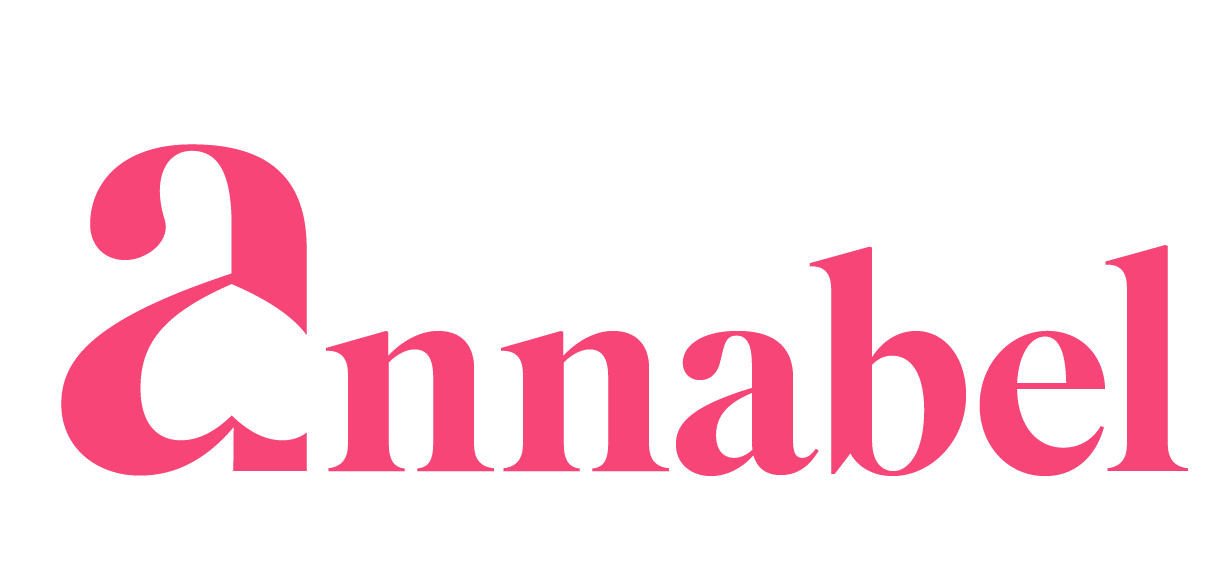
We began the identity creation by brainstorming name ideas and creating a mood-board to capture the vision for the brand. The name we decided on was 'The Vast Collective' since we wanted it to capture the idea of bringing lots of people and artists together to form one community - or collective. The brand pattern was the first element of the identity we decided on, and due to it's nature, it required us to discard any logomark designs and commit to a logotype for the identity instead.
Amongst the required deliverables, we also created a welcome banner, ceiling projection animation, website landing page animation, and mockup editorial magazine displaying artwork from different cities. I was assigned to the animation/motion element of the deliverables and the letterhead, compliment slip, and website landing page mockups, as well as redesigning and refining the brand pattern from the initial design a teammate had created.
This page does not display the full visual identity created, only the final elements included in the identity that I was responsible for.

Core Brand Pattern
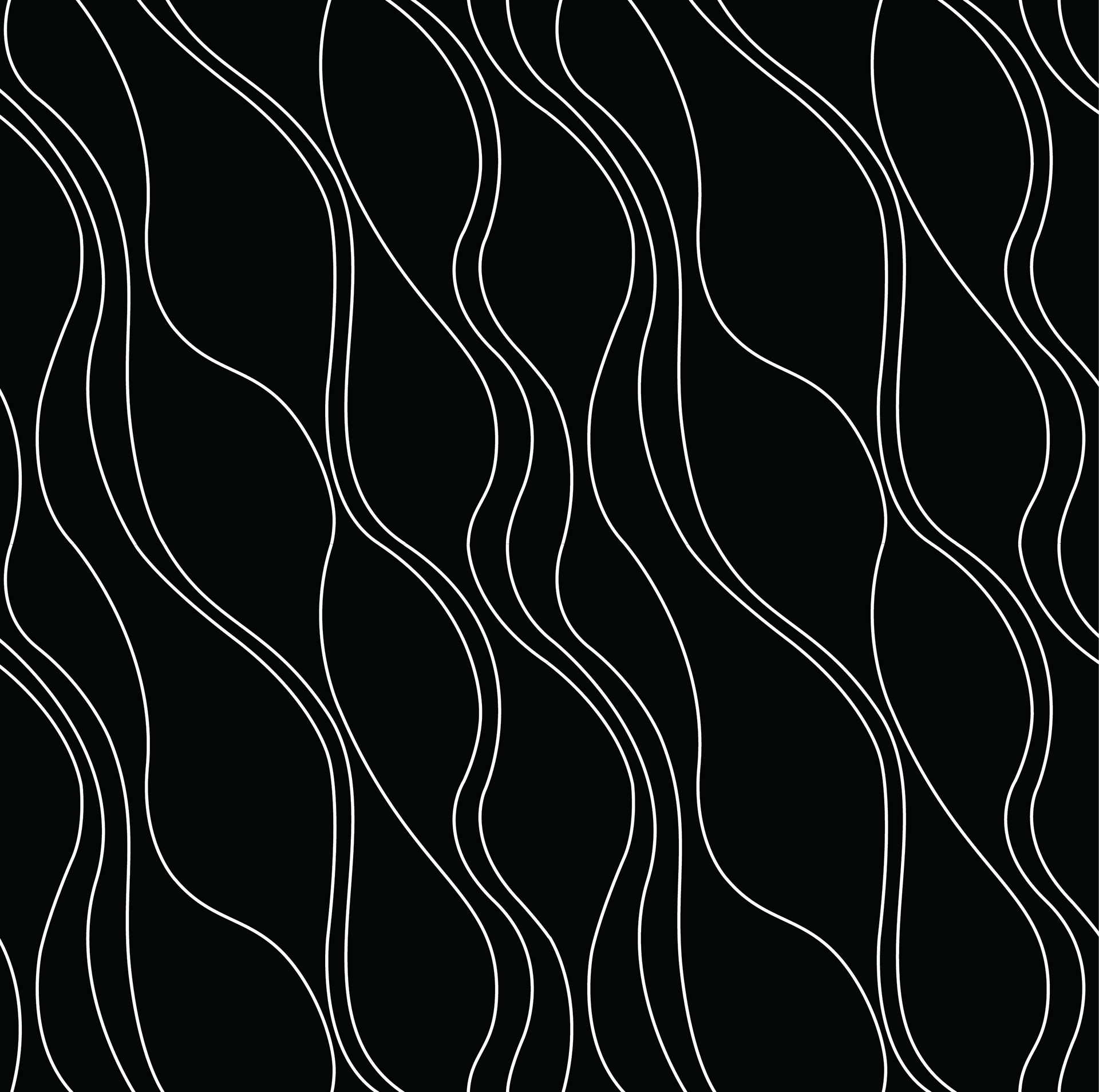
Expanded Brand Pattern
The first element of the final identity I was responsible for was the final design of the brand pattern. A teammate came up with the original brand pattern concept and design, but I became responsible for fine tuning this. The original size of the brand pattern is the image above labelled 'core brand pattern', and it reflects roughly the size of the original brand pattern created by my teammate.
However, we wanted the pattern to be expandable so that it could cover larger surface areas, so my first edit to the it was making sure the line ends on all edges matched up to create a tile of the pattern that could be expanded in any direction. My final task was to smooth out the pattern and ensure each of the curves and lines worked with each other, giving the final pattern tile and expanded pattern that would be used throughout the identity seen above.
Ceiling projection motion element
Website landing page motion element
Our reason for choosing to create something to project onto the ceiling of the shipping container was to help reinforce the brand identity throughout the physical space without overpowering the artwork customers were there to see. We decided that an animated version of the brand pattern would be best for this and would help create an immersive experience, as well as reflect the energy of the brand.
When creating the motion element for the website landing page, we wanted to use both the brand pattern and logotype together in order to present the core of the brand identity as the first touchpoint for online customers. Animating both the logotype and the brand pattern would be too busy, so we decided to animate just the logotype in a way that reveals the brand name.
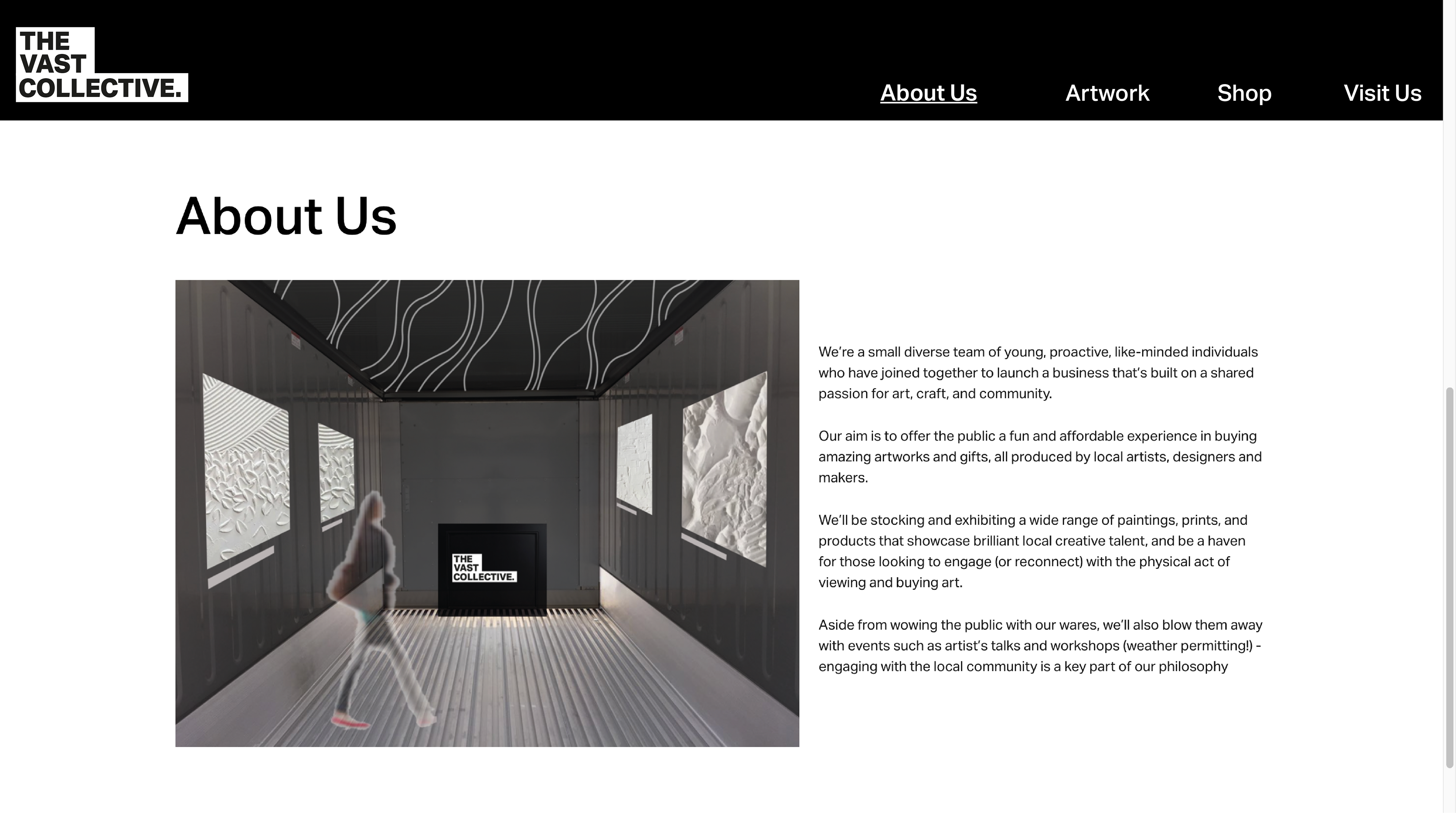
Website landing page
After the motion element above, the website landing page would then scroll down to the page pictured on the left, displaying a section about the start-up enterprise, before the user could navigate to the other pages pictured in the navigation bar. Having the 'about us' section as the landing page was decided on the basis that, where the physical space was focused on the art itself, the website was for the brand first, to help gain loyal customers and explain to interested artists about the brand.
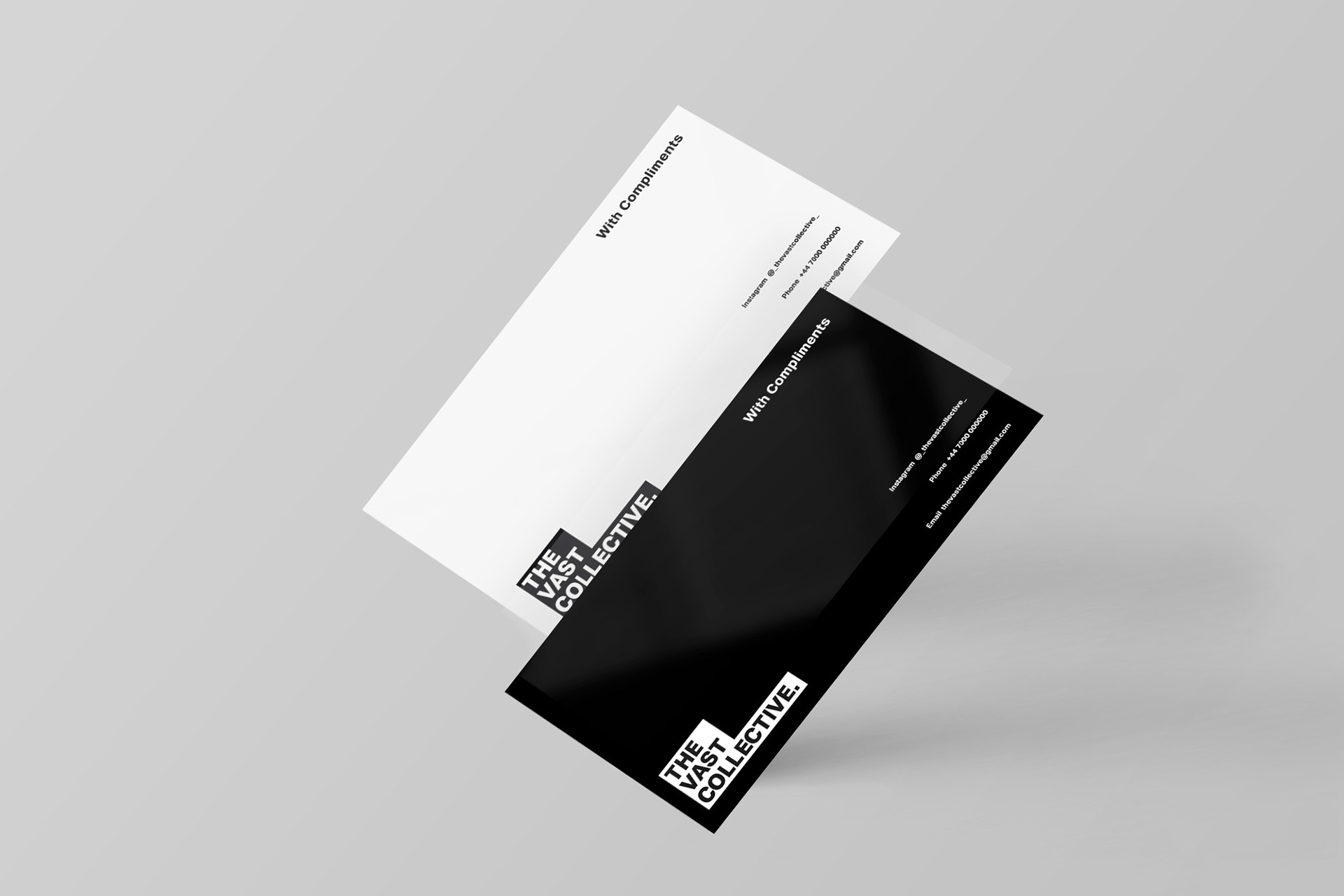
Print Collateral - Compliment Slip
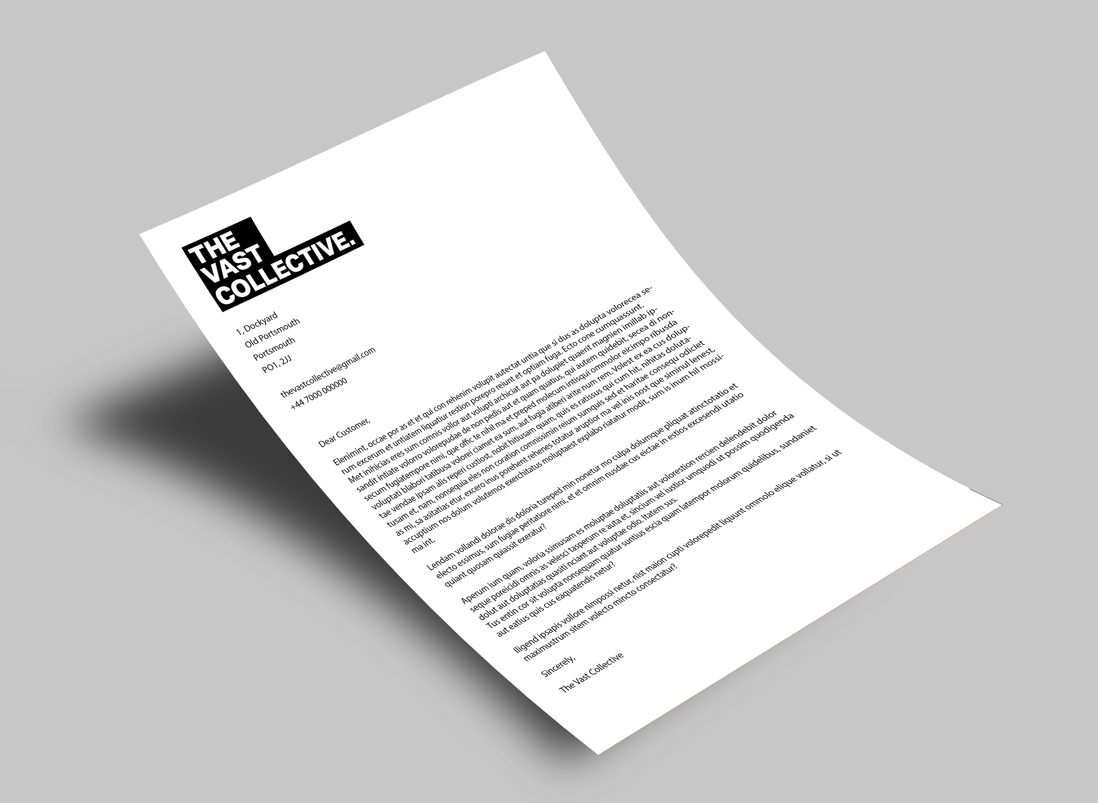
Print Collateral - Letterhead