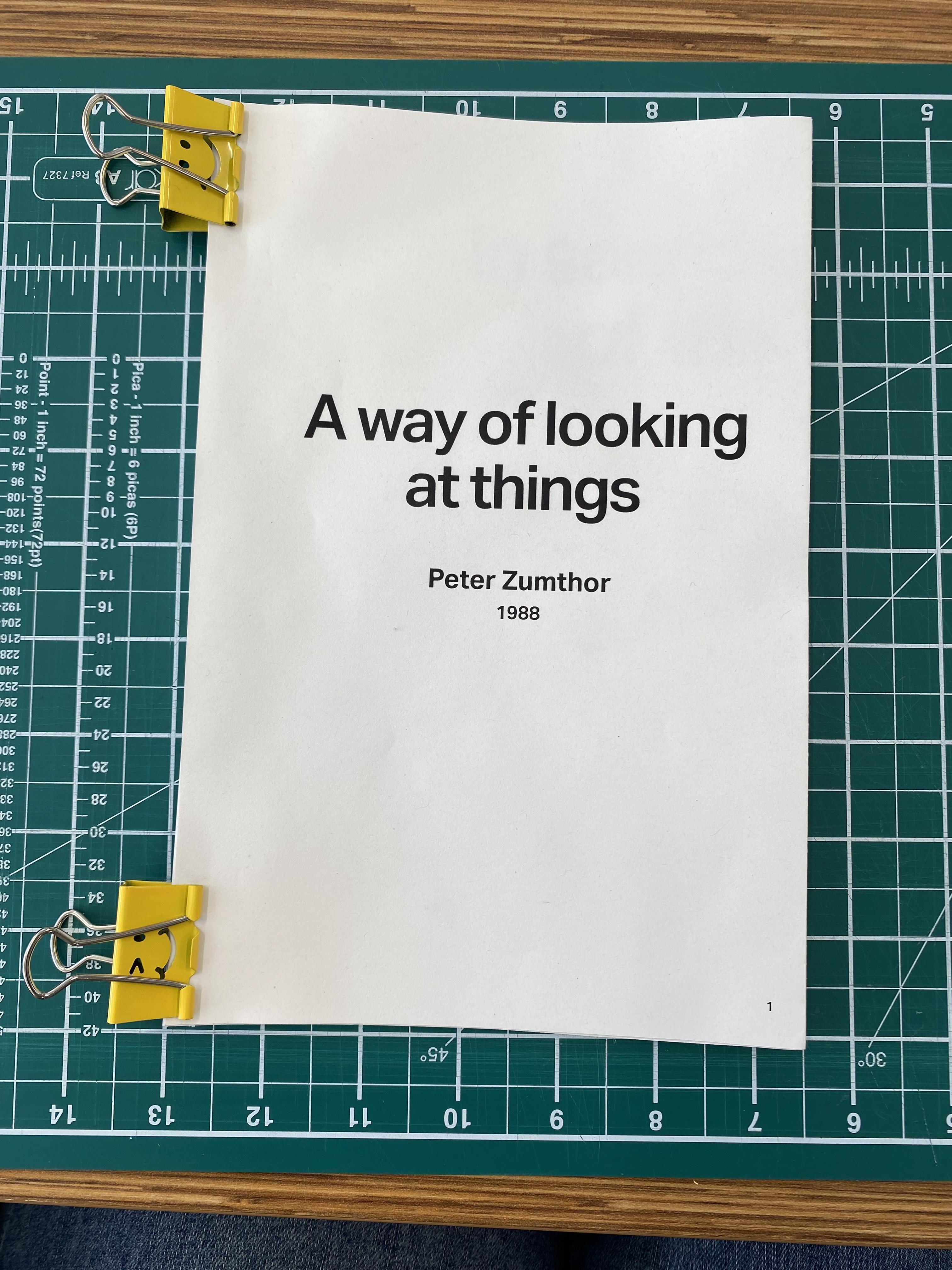
A Way Of Looking At Things
Editorial Design & Book Production
Brief
Design and produce a 32 page book for the text "A way of looking at things" by Peter Zumthor. The typographic and editorial design choices must be dictated by the content and themes of the text. The final produced book should be bound using either the French fold or Japanese stab binding methods.
Final Produced Book
Insights
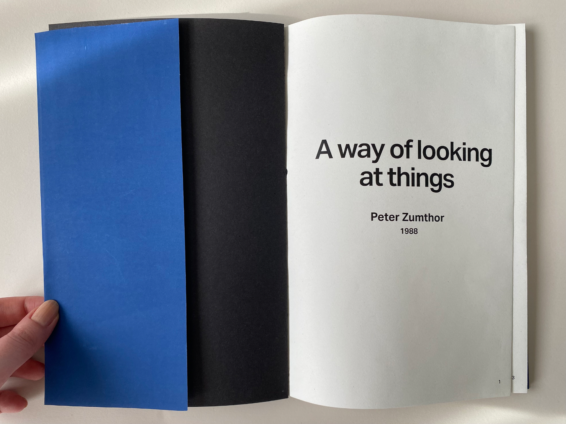
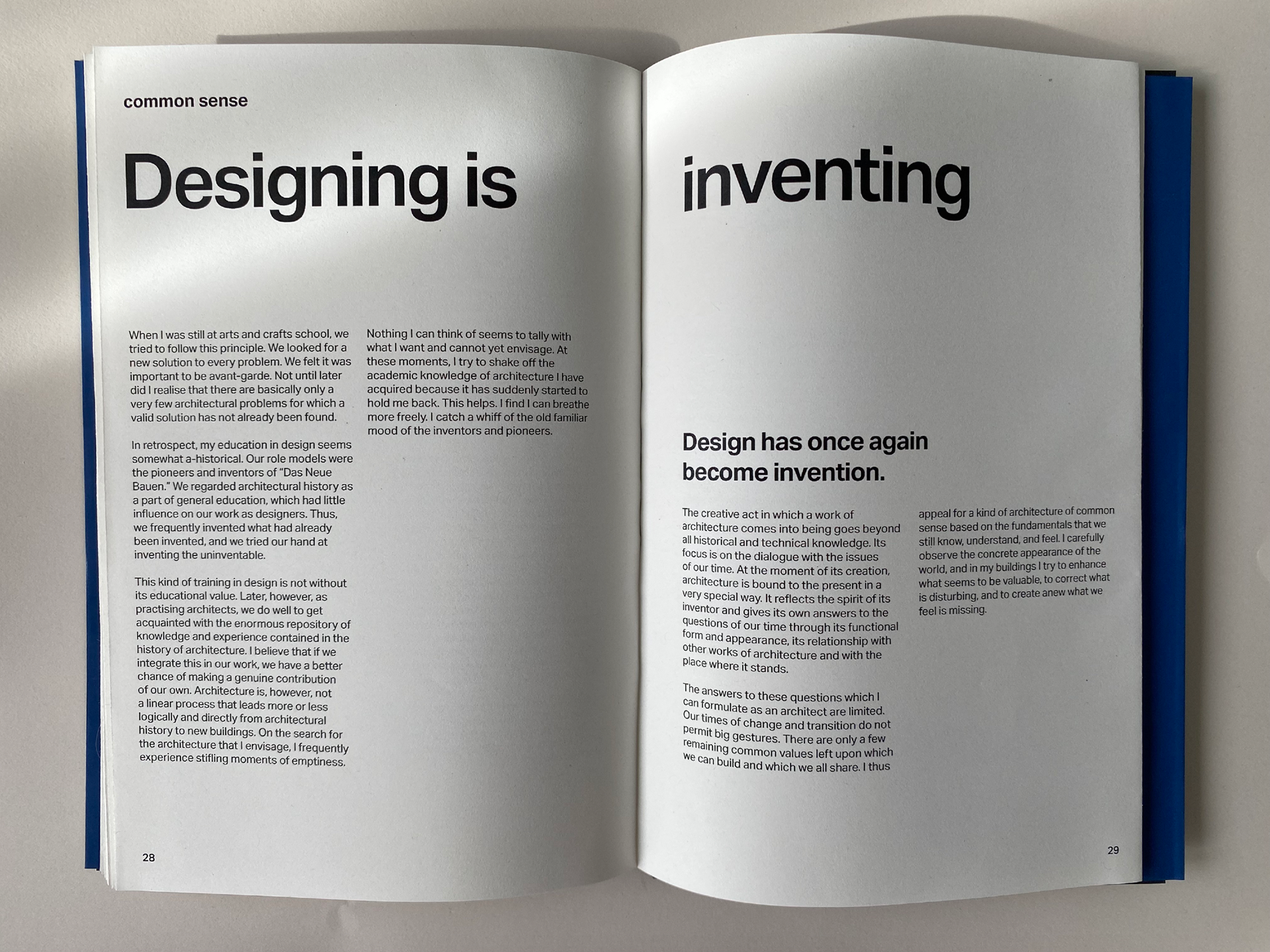
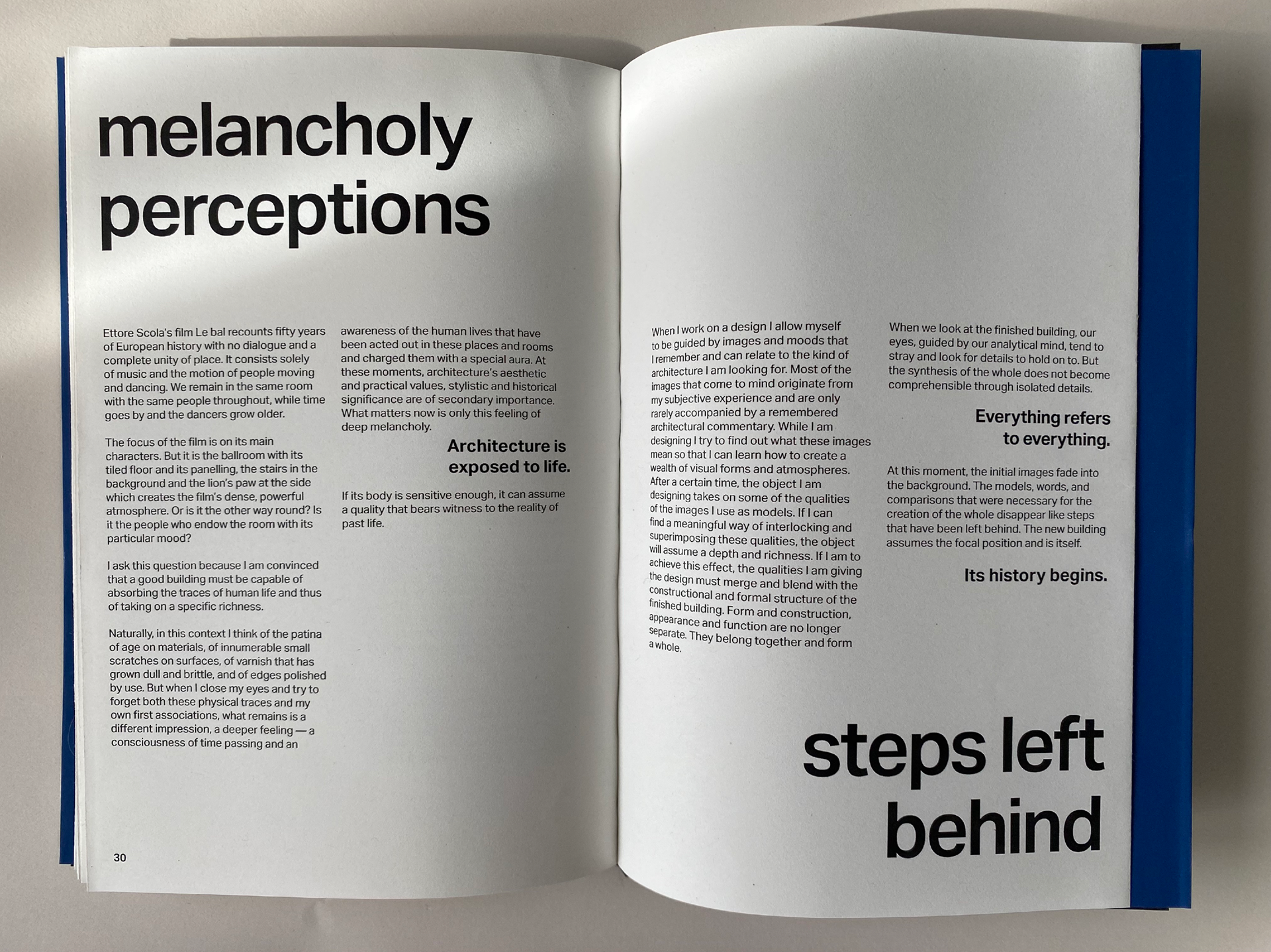
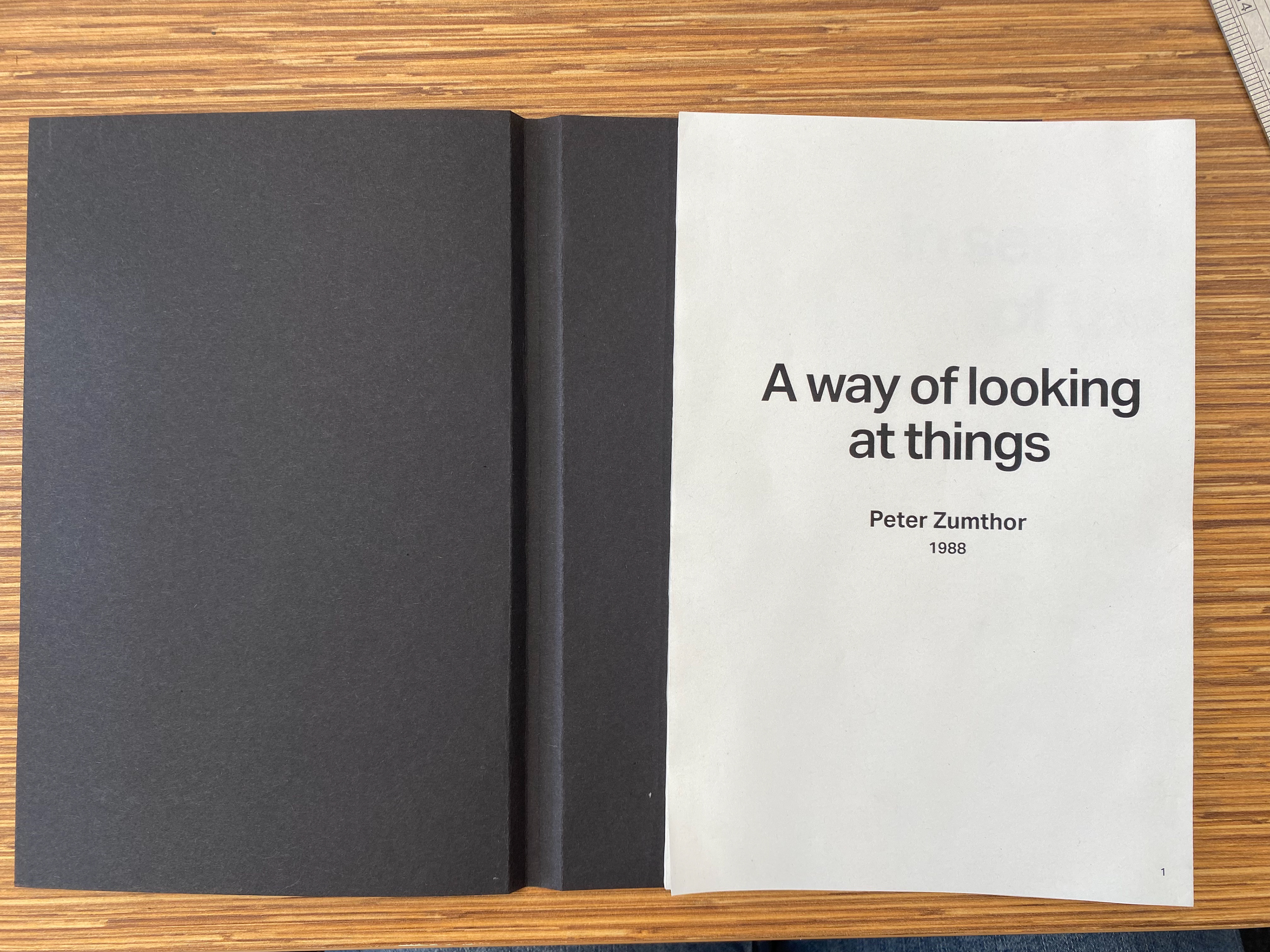
Because Zumthor is a Swiss architect and uses lots of clean cut lines in his work, I wanted my design to reflect this. The main way I achieved this was by choosing Aktiv Grotesk as the typeface for this book. I felt it's Swiss style and similarity to modernist design best represented Zumthor's work.
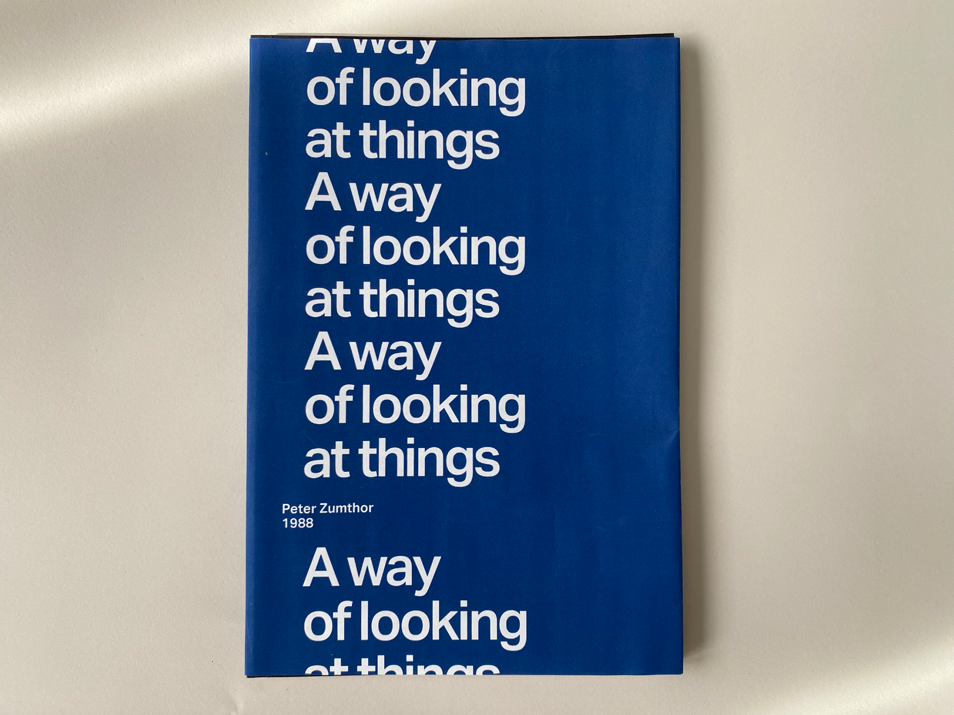
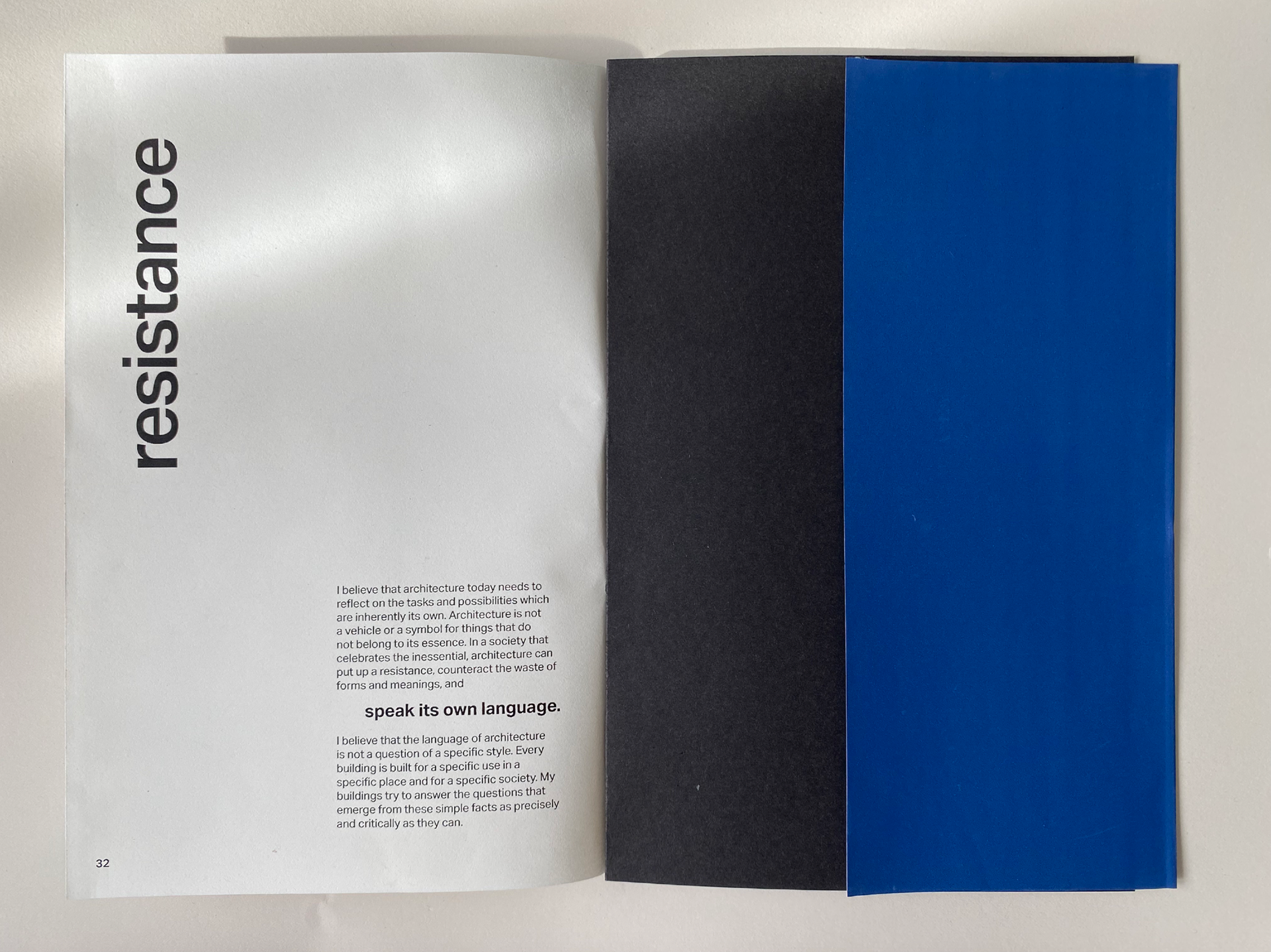
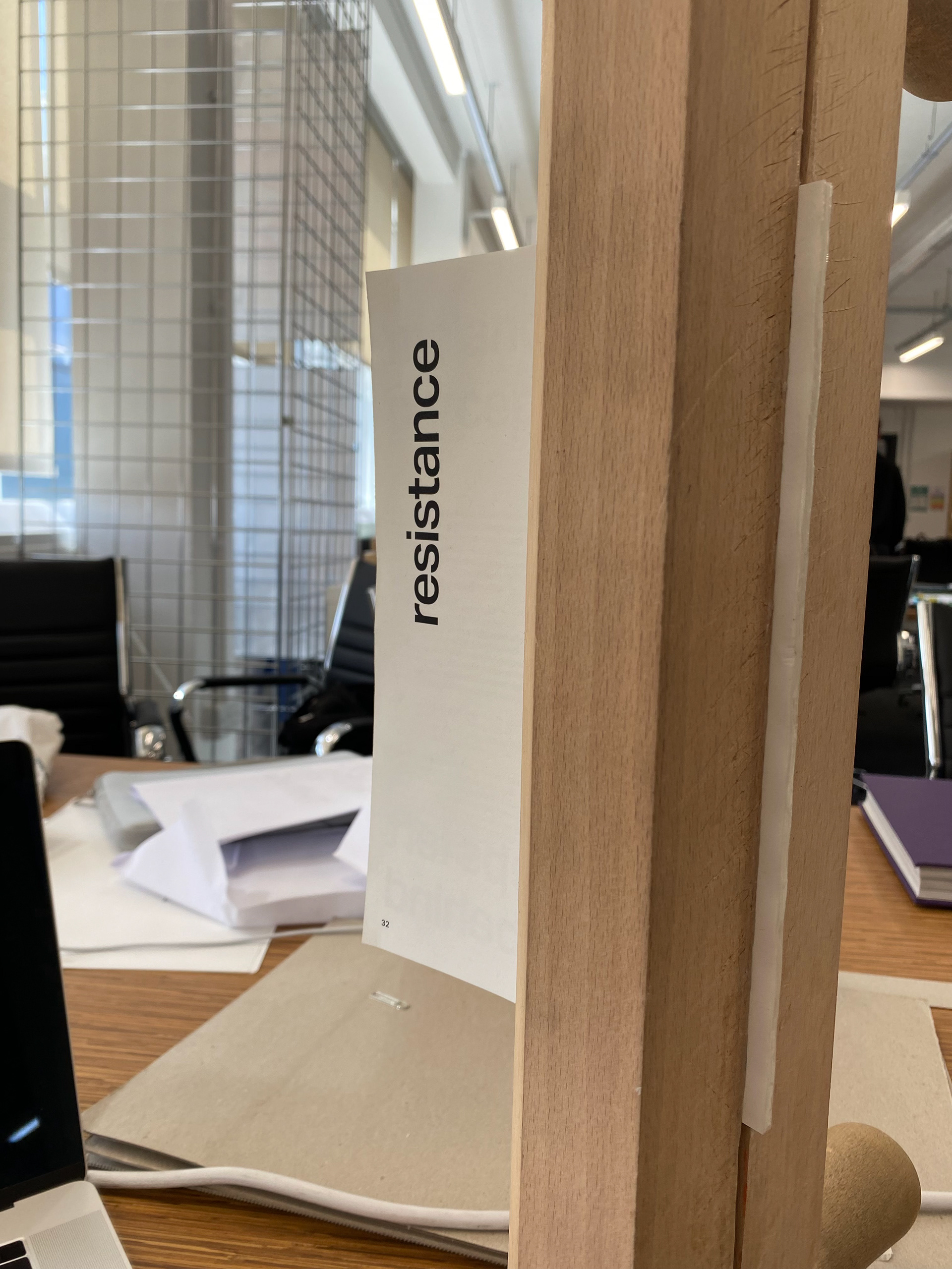
The dust jacket design for this book was inspired by the texture of Zumthor's architecture - he uses lots of thin, continuous lines on his buildings, both horizontal and vertical. The title of the text infinitely running down the dust jacket is meant to emulate this and portray Zumthor's work typographically.
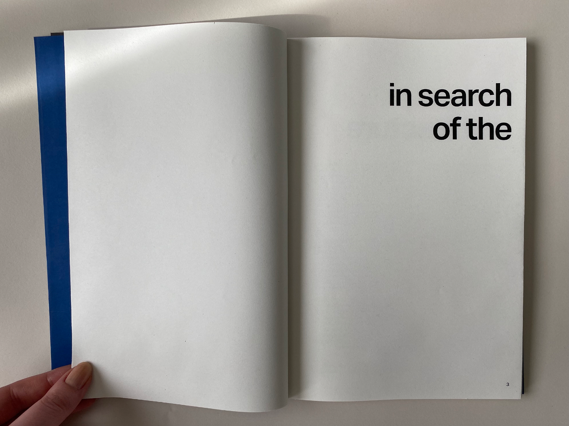
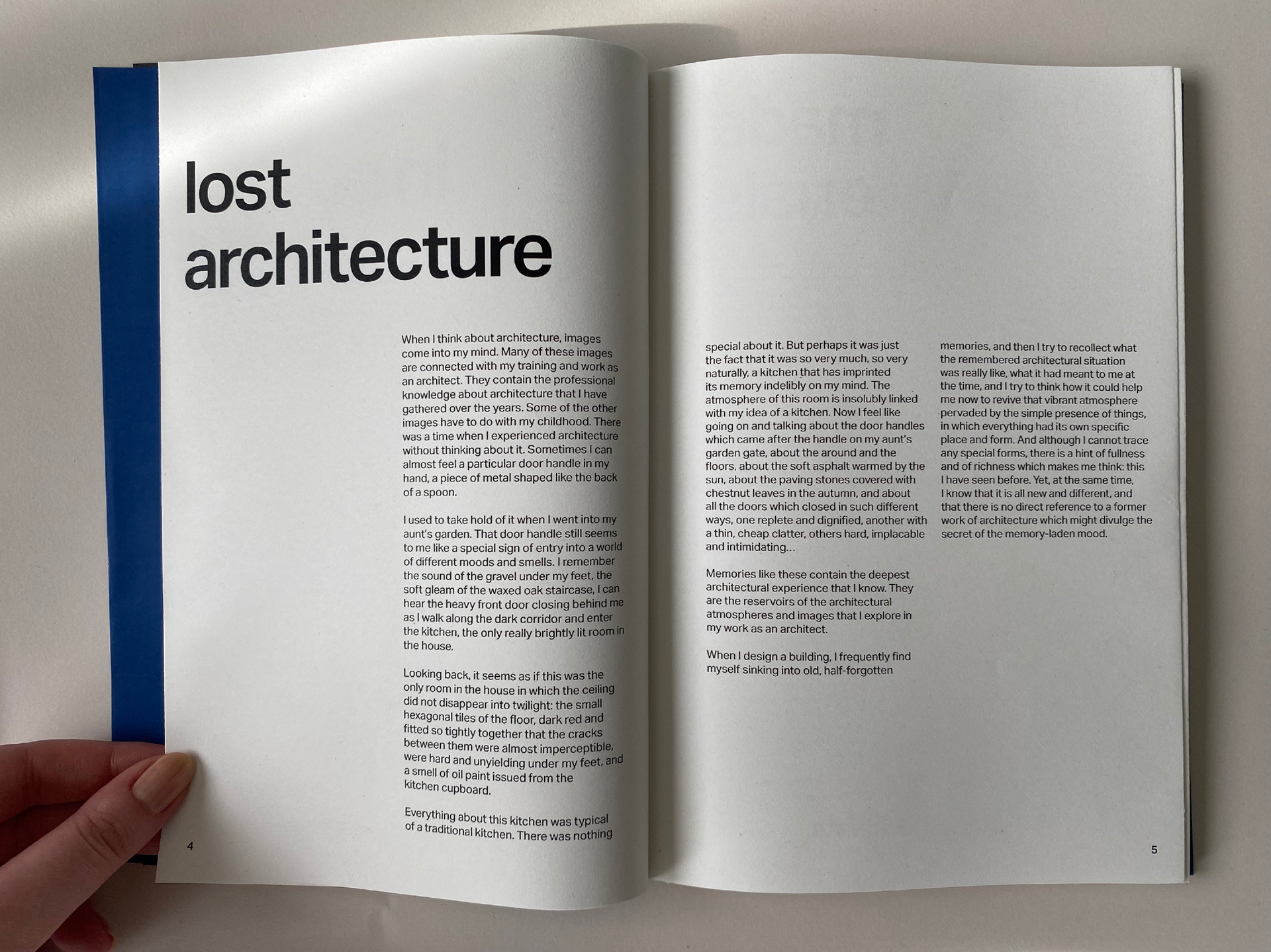
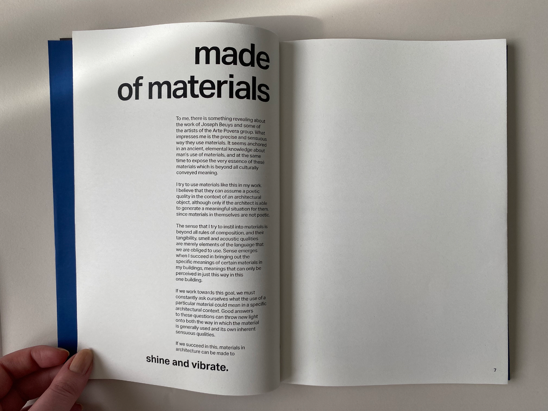
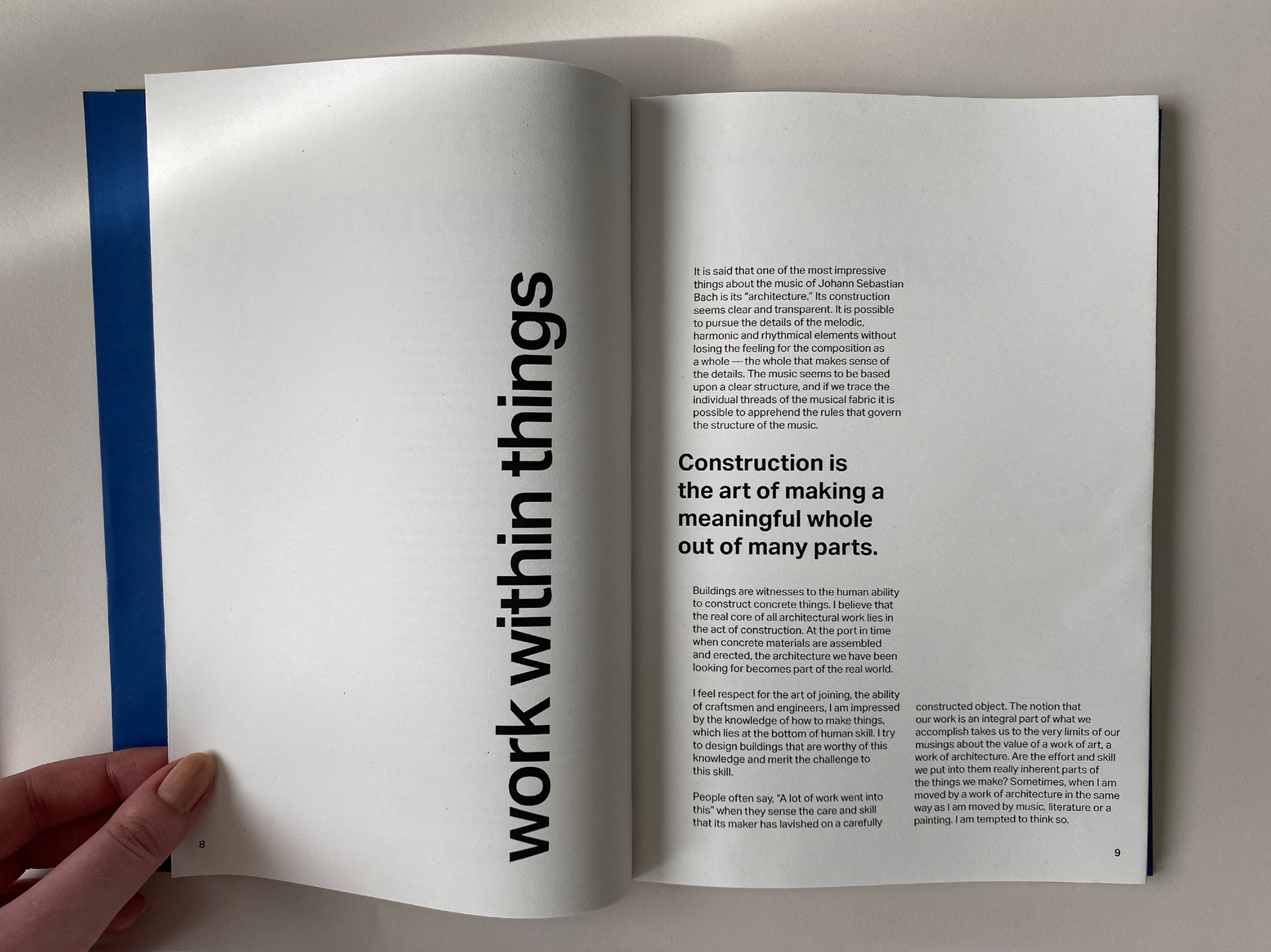
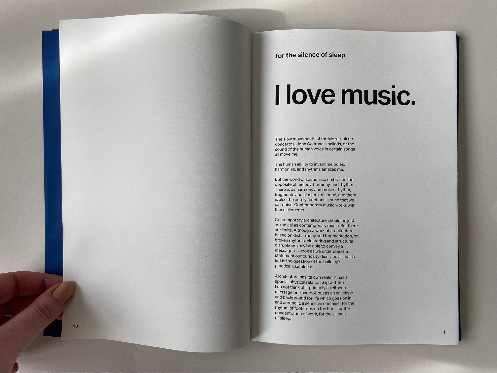
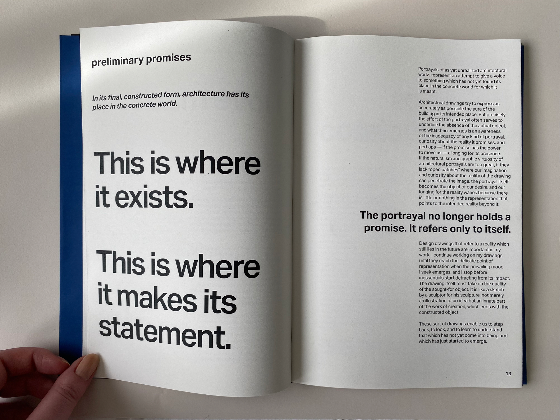
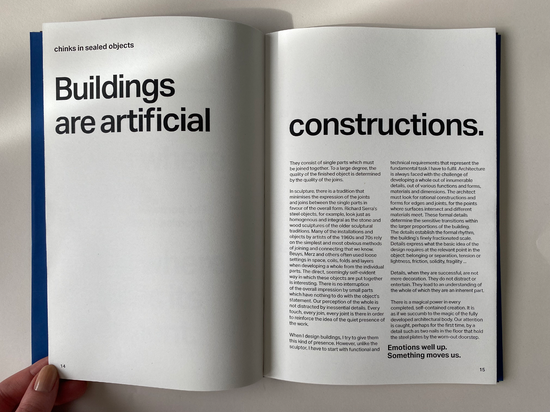
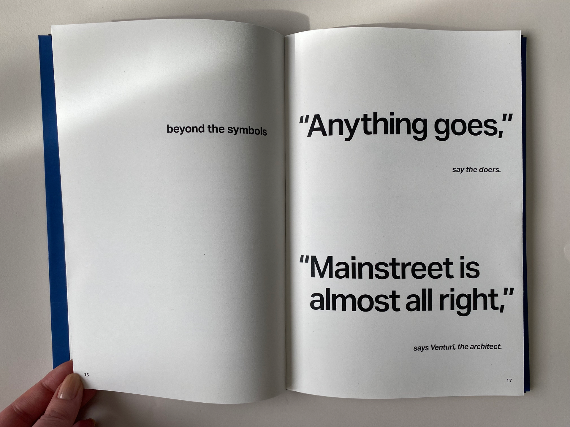
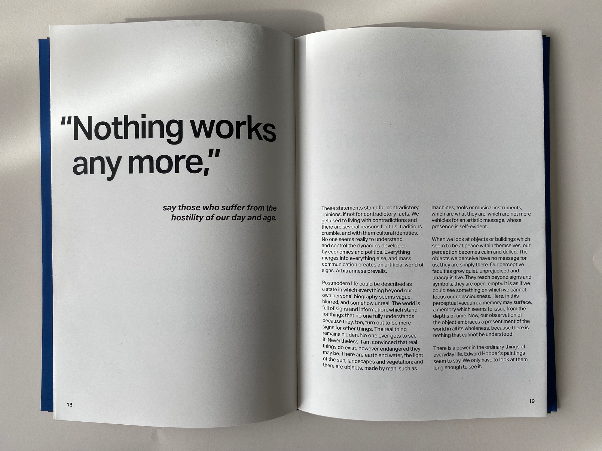
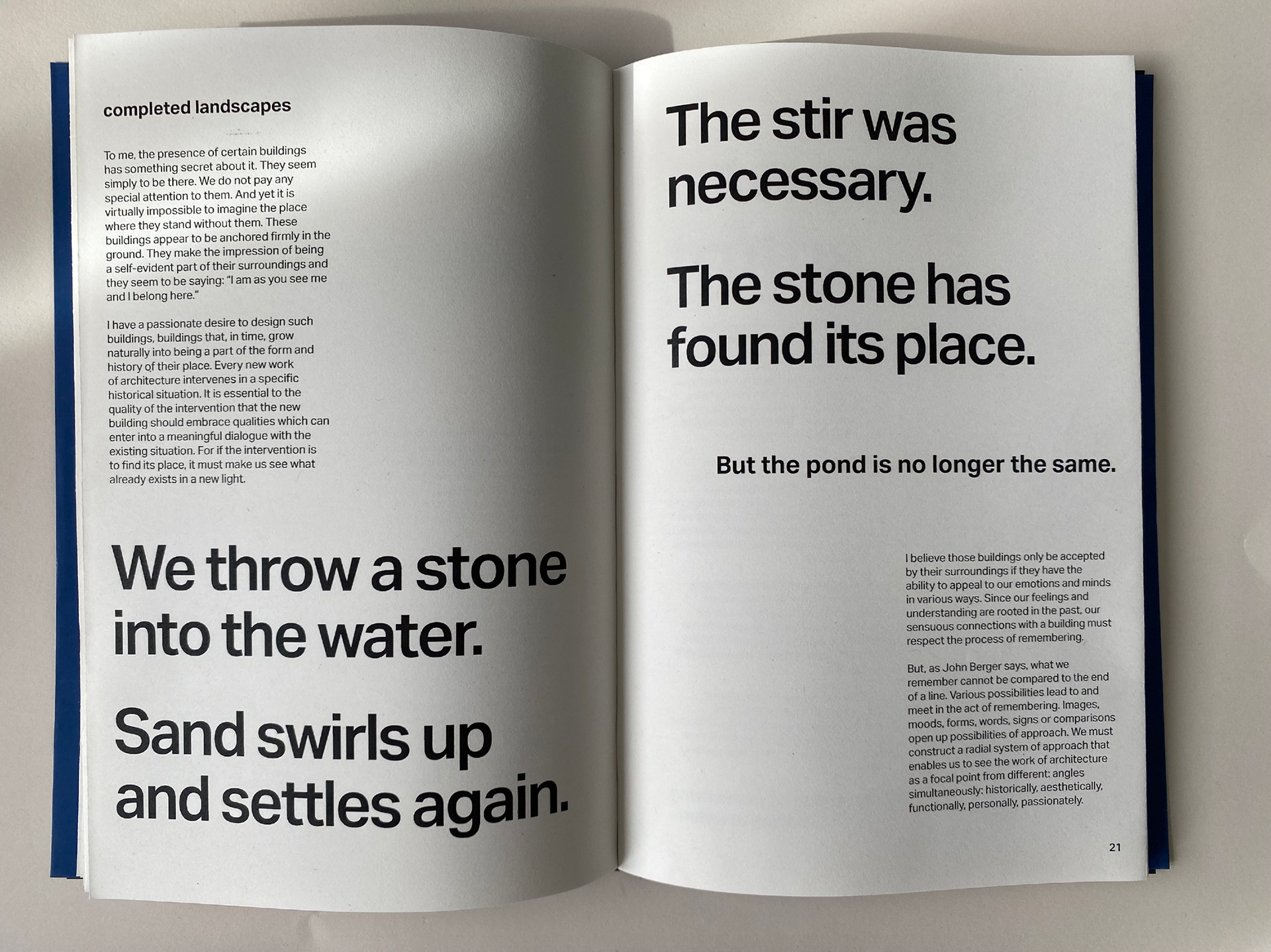
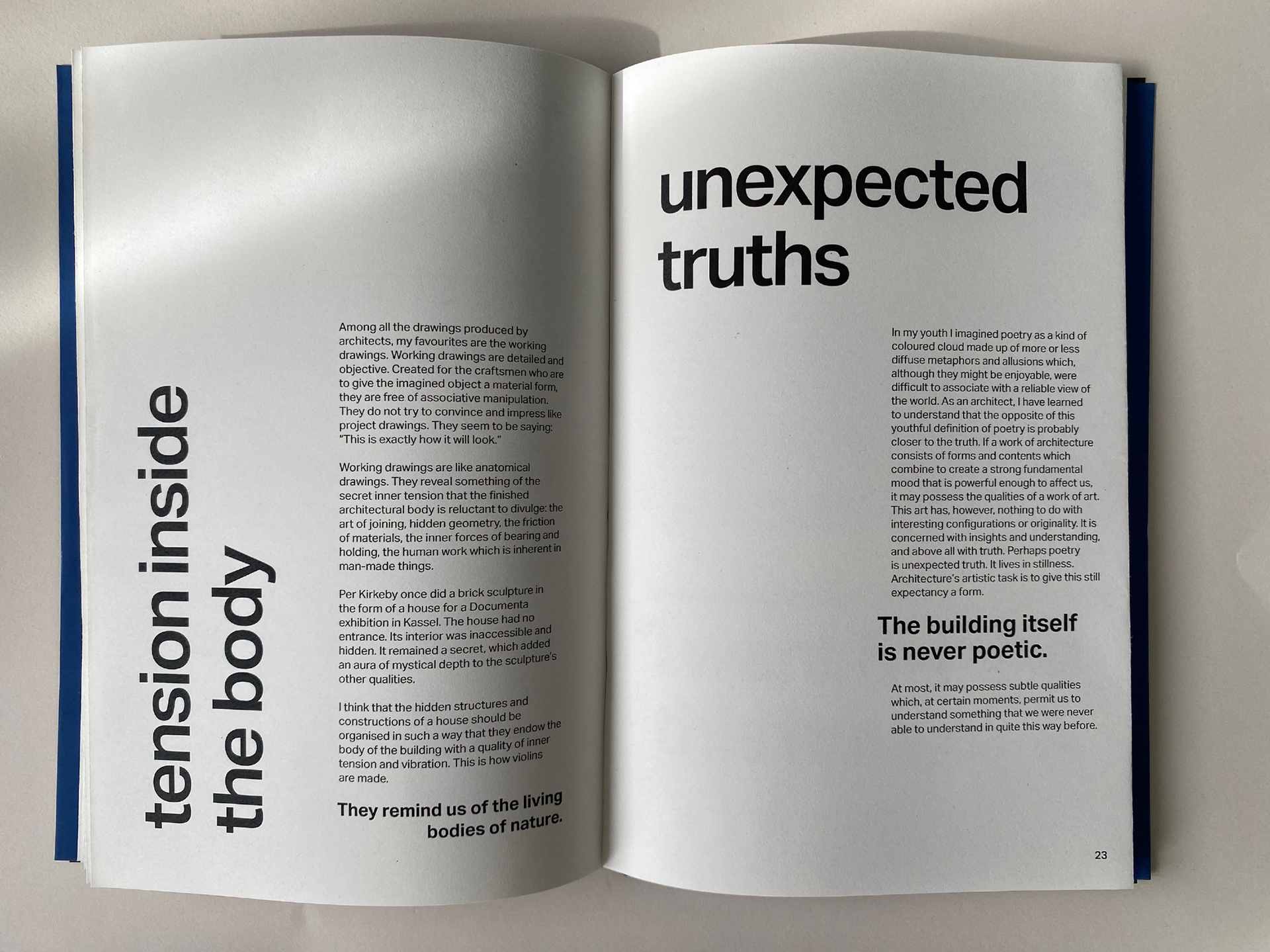
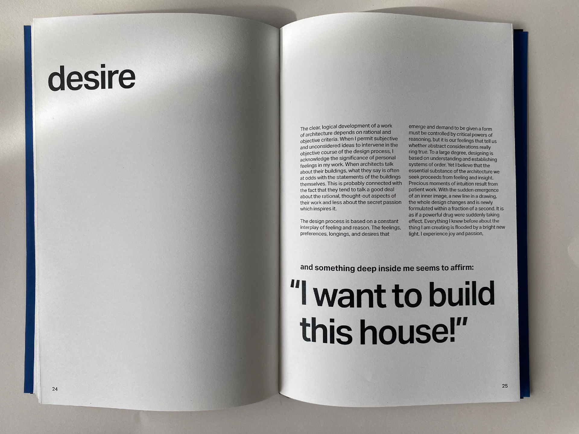
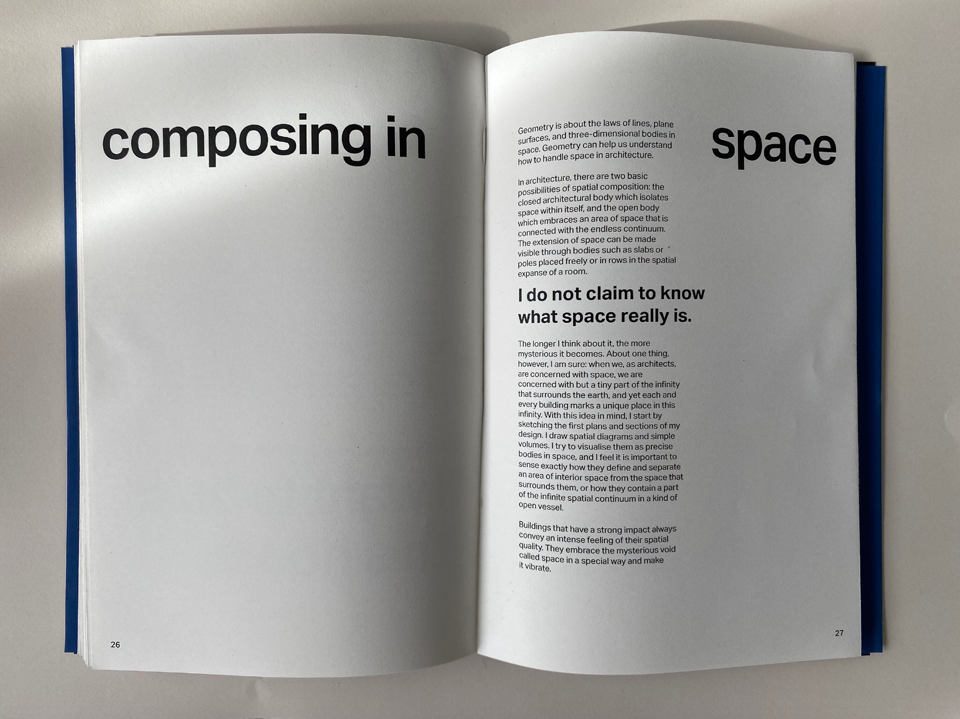
Inside the book, the design is instead guided by the poetic and passionate way Zumthor talks about architecture, highlighting the metaphors and anecdotes that display his love for his work.
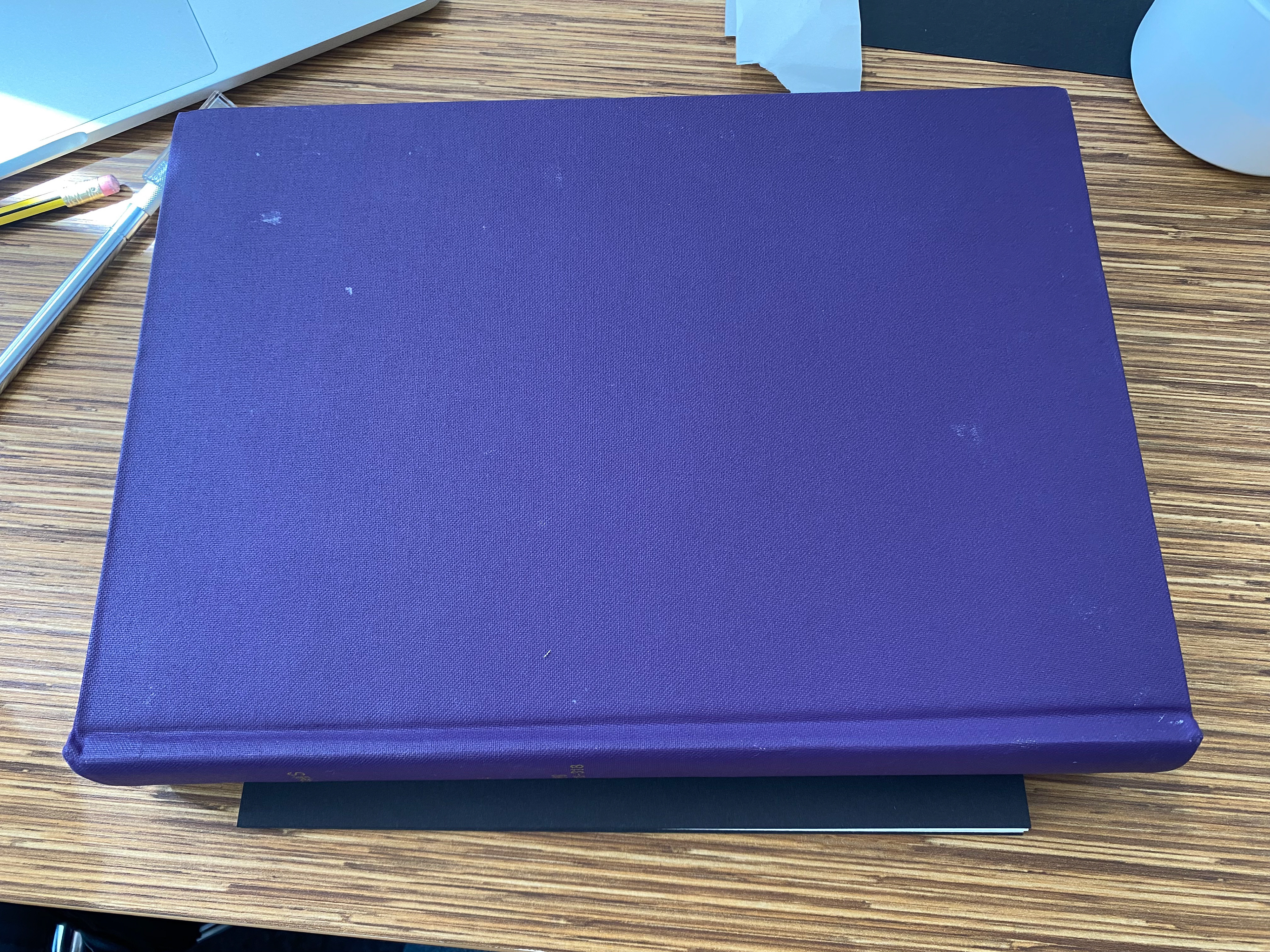
I chose to bind the book using the French fold method, as this produces a cleaner look with the lines of the book and best fits the style of my design.
Book Binding Process
The final printed and cut pages folded ready to be glued.
Process of the glue that creates the spine of the book drying.
Bound pages and scored and folded book cover ready to be glued together.
Final bound book drying with applied pressure to prevent movement.